

Dark website design inspiration
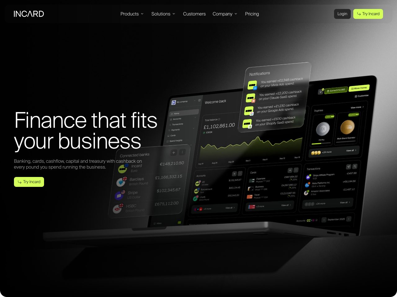
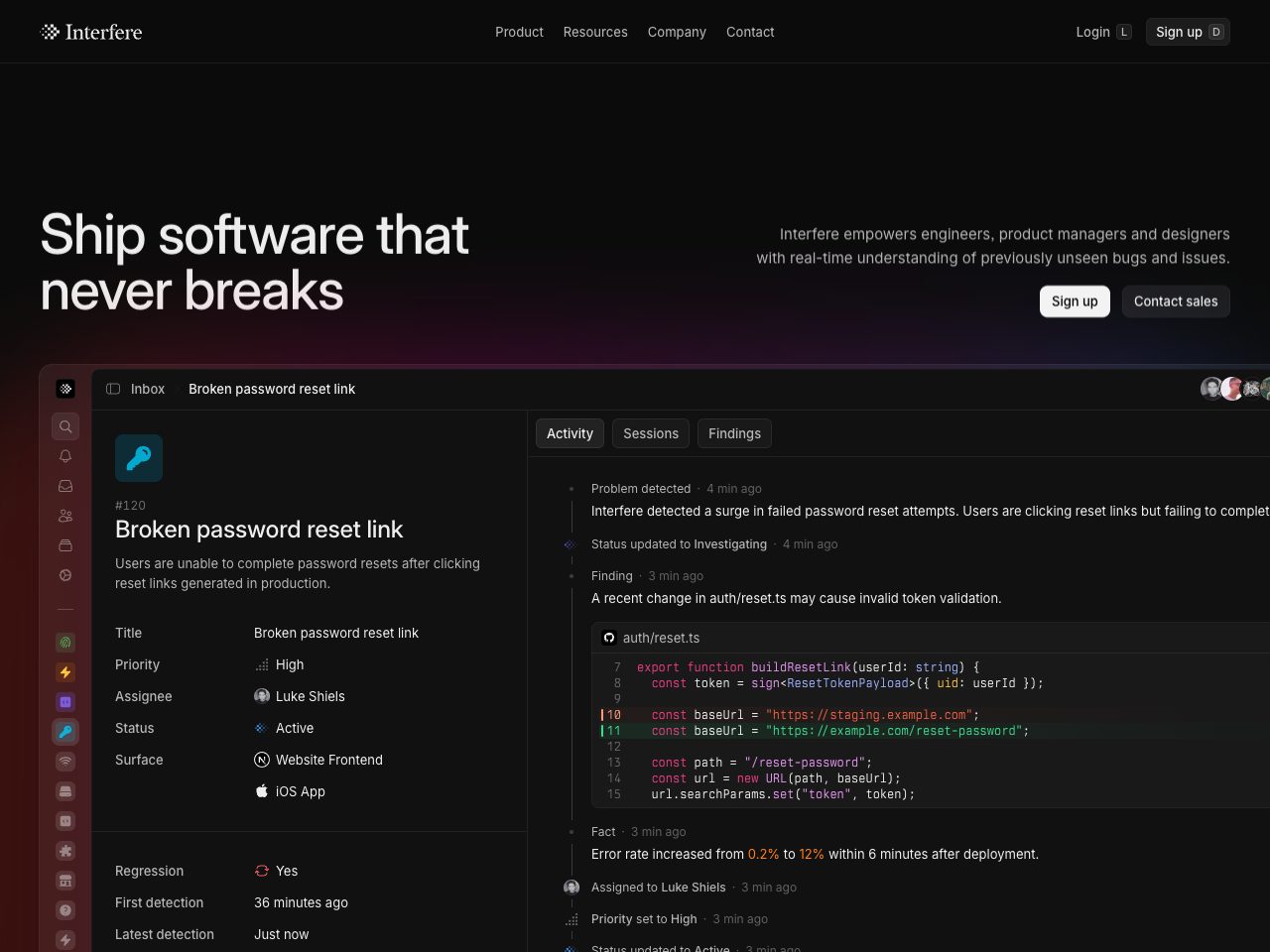
Dark interfaces need different rules: pure black rarely works, contrast has to be earned with elevation rather than borders, and one accent colour goes a very long way. These are the sites that get it right.
125 sites
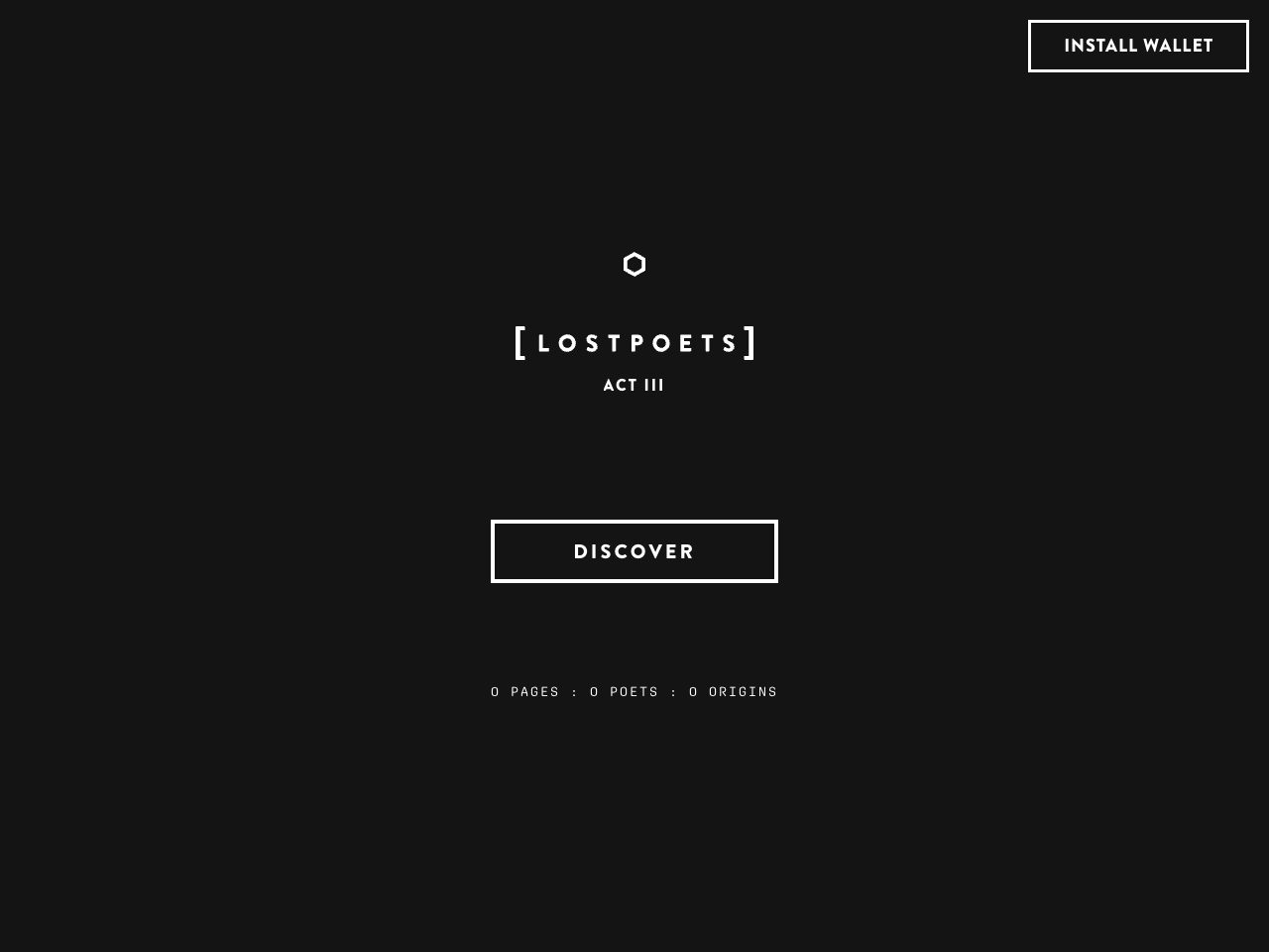
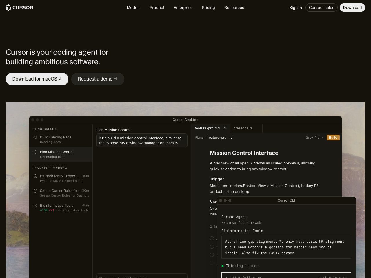
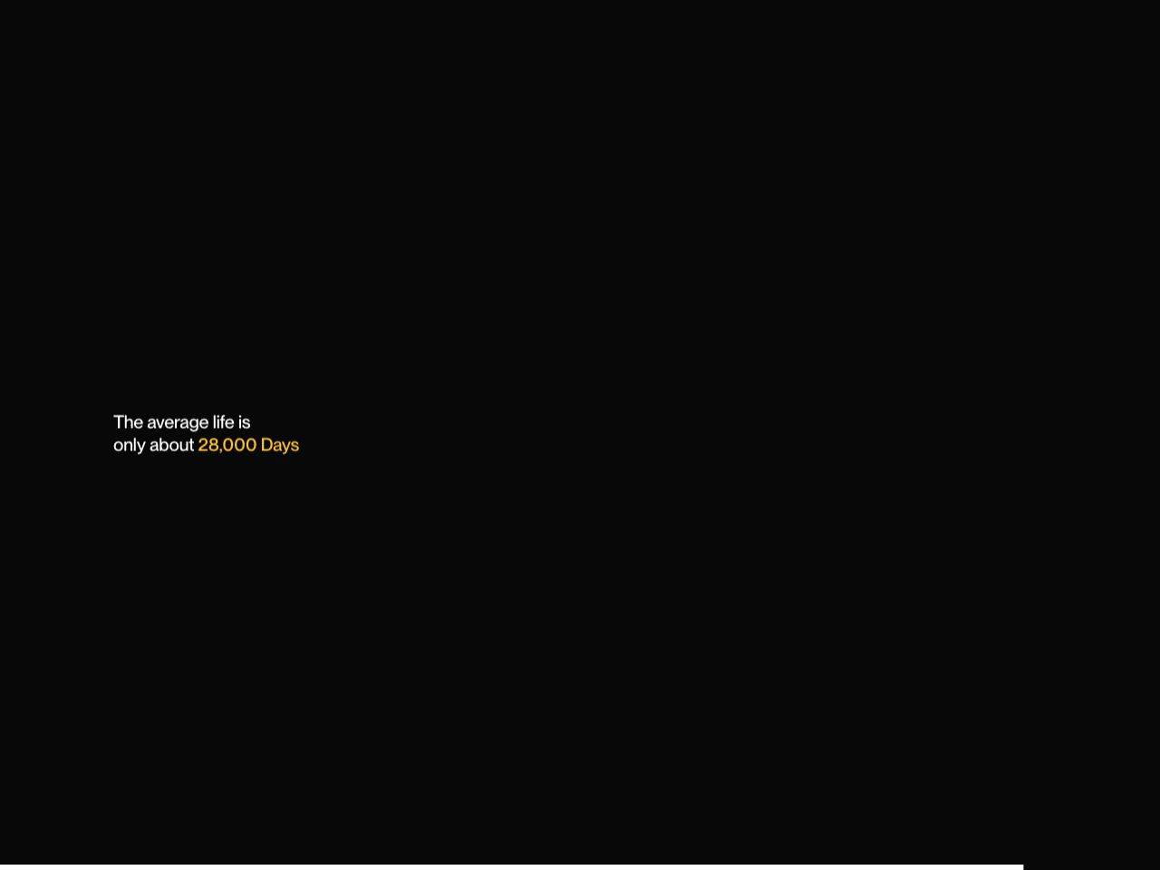
28K Studio
Agency
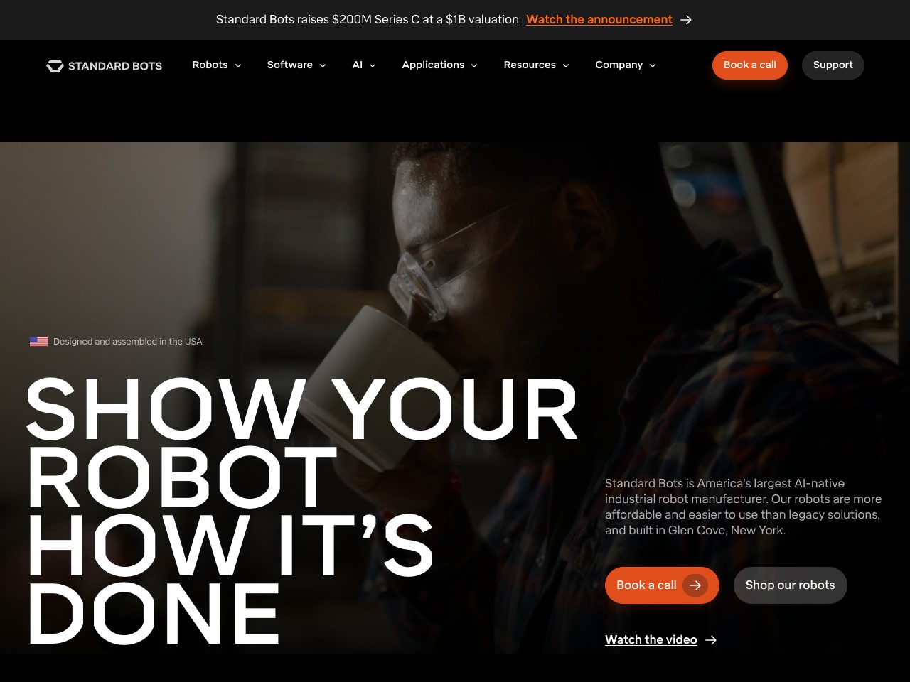
Standard Bots
Startup
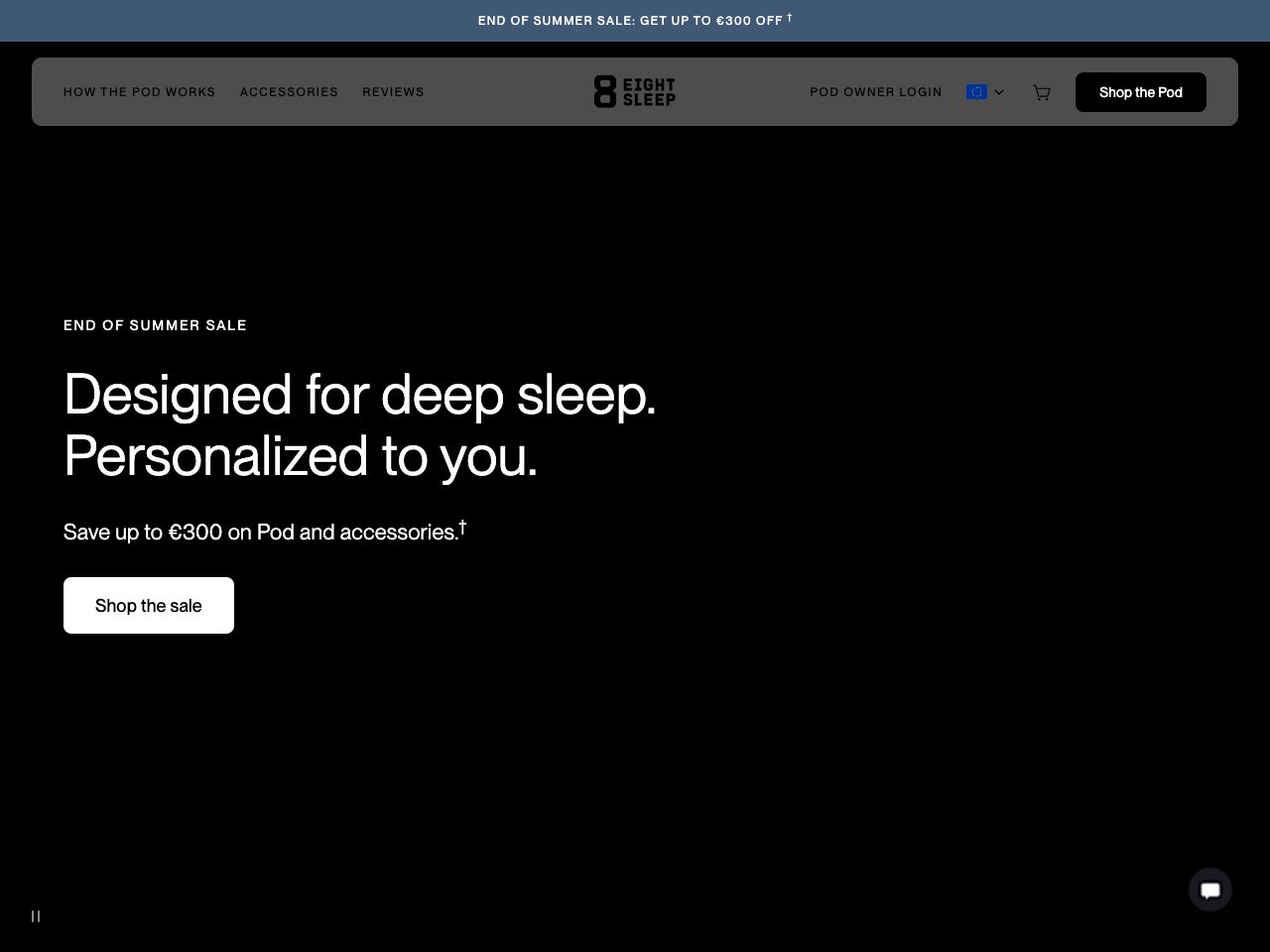
Eight Sleep
Startup
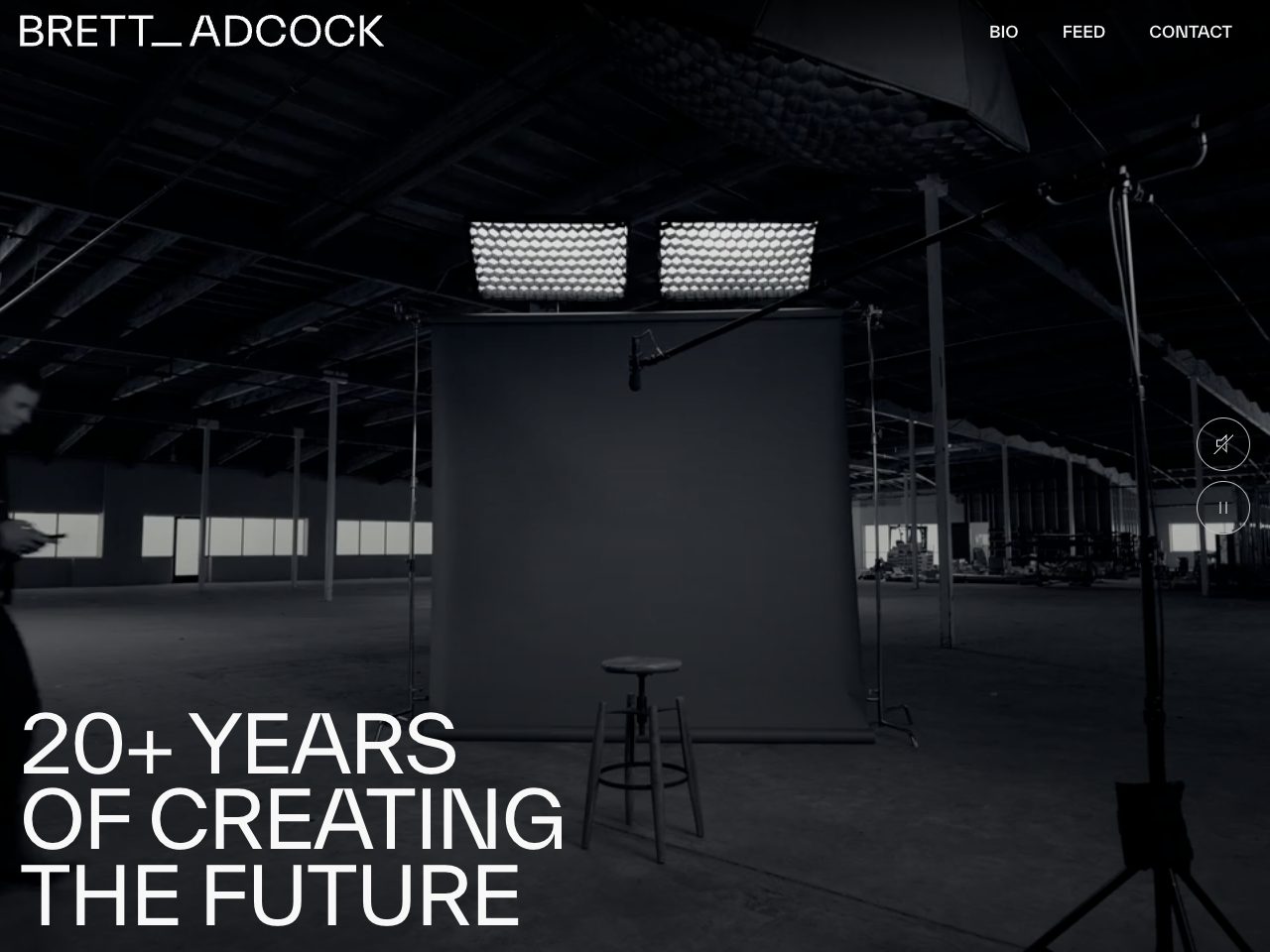
Brett Adcock
Portfolio
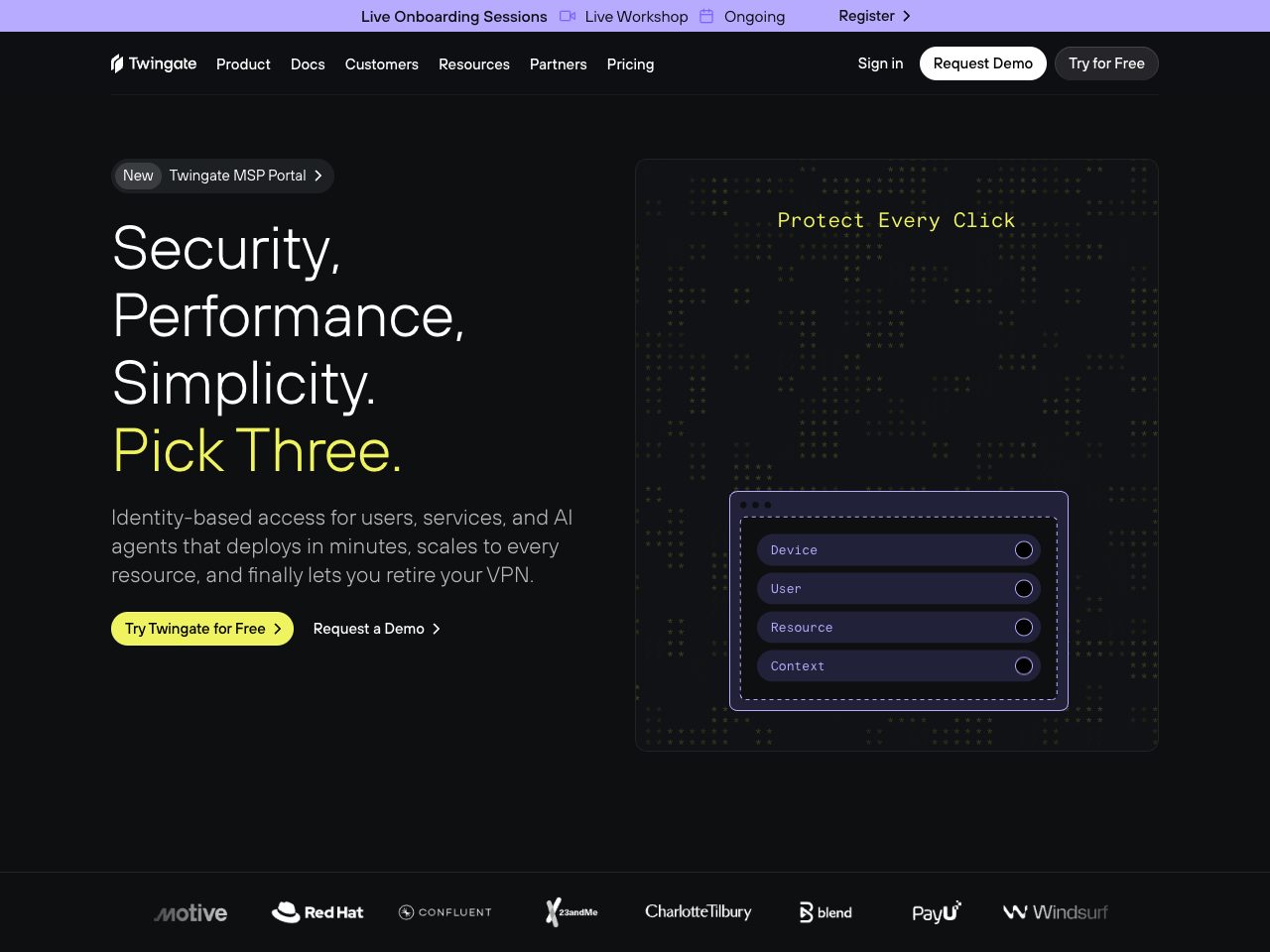
Locomotive
Agency
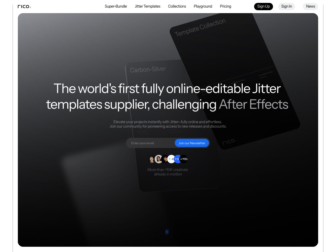
Rico Supply
Creative
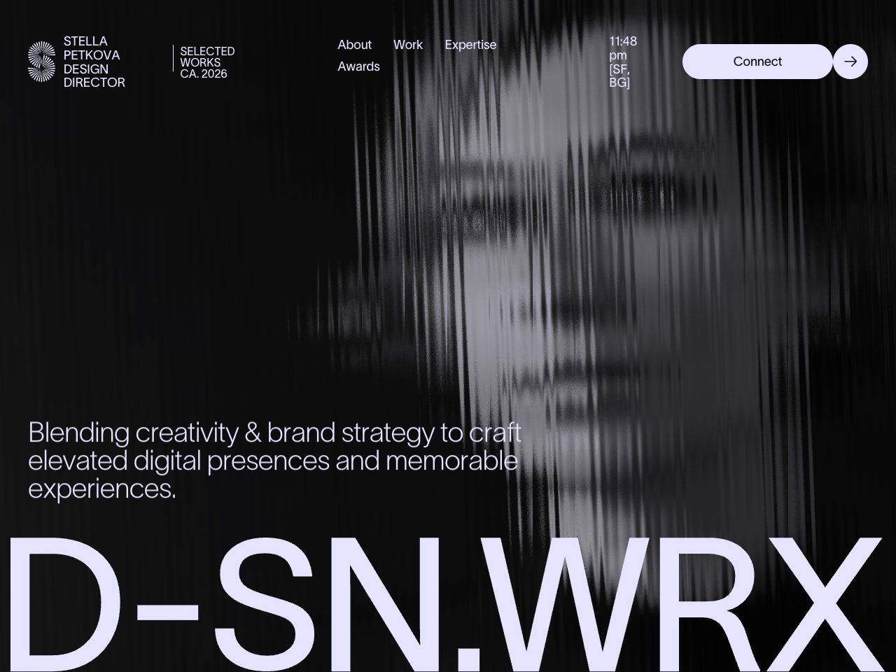
Stella Petkova
Portfolio
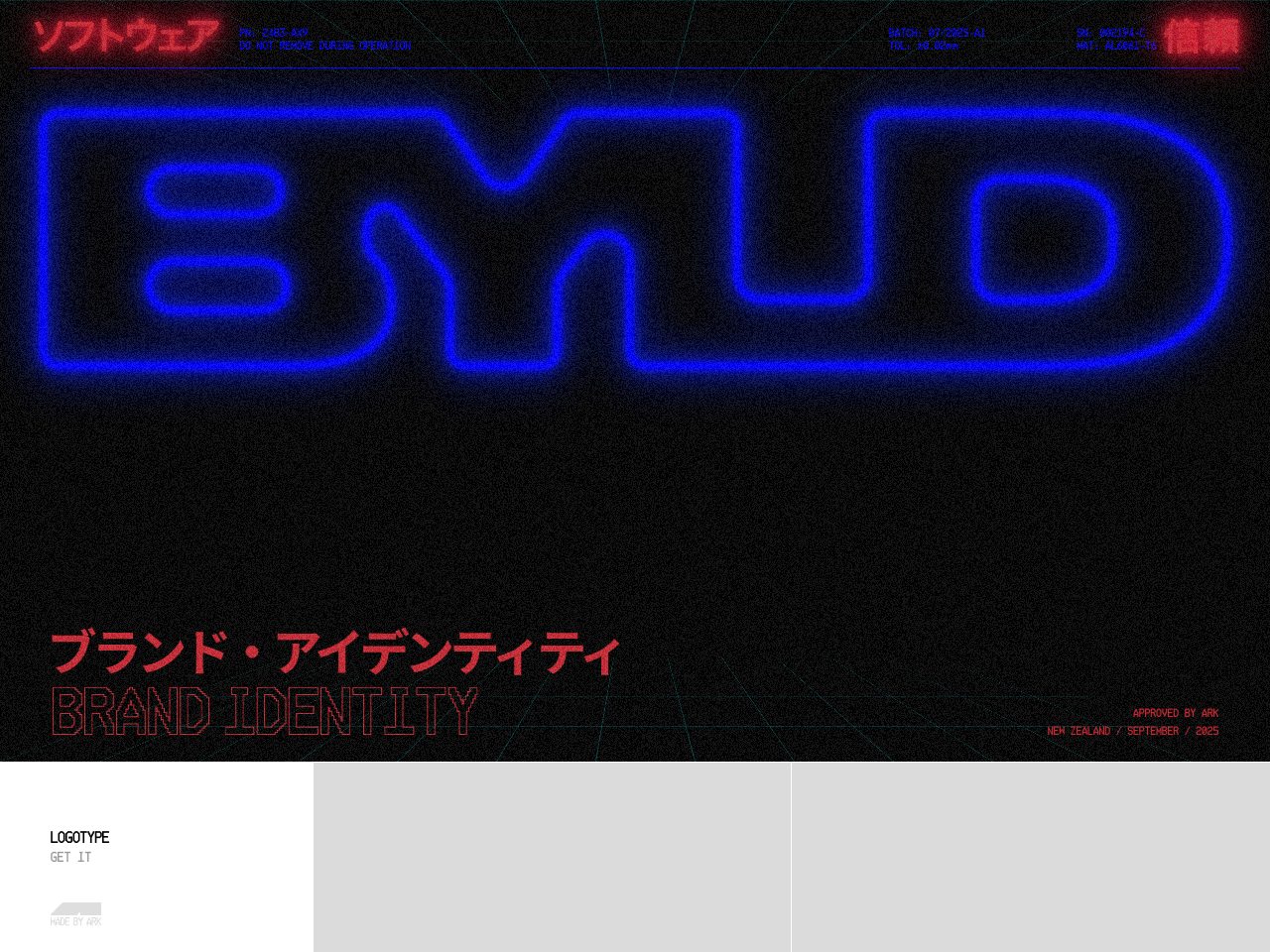
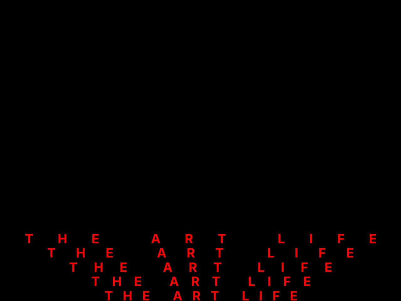
David Lynch
Creative
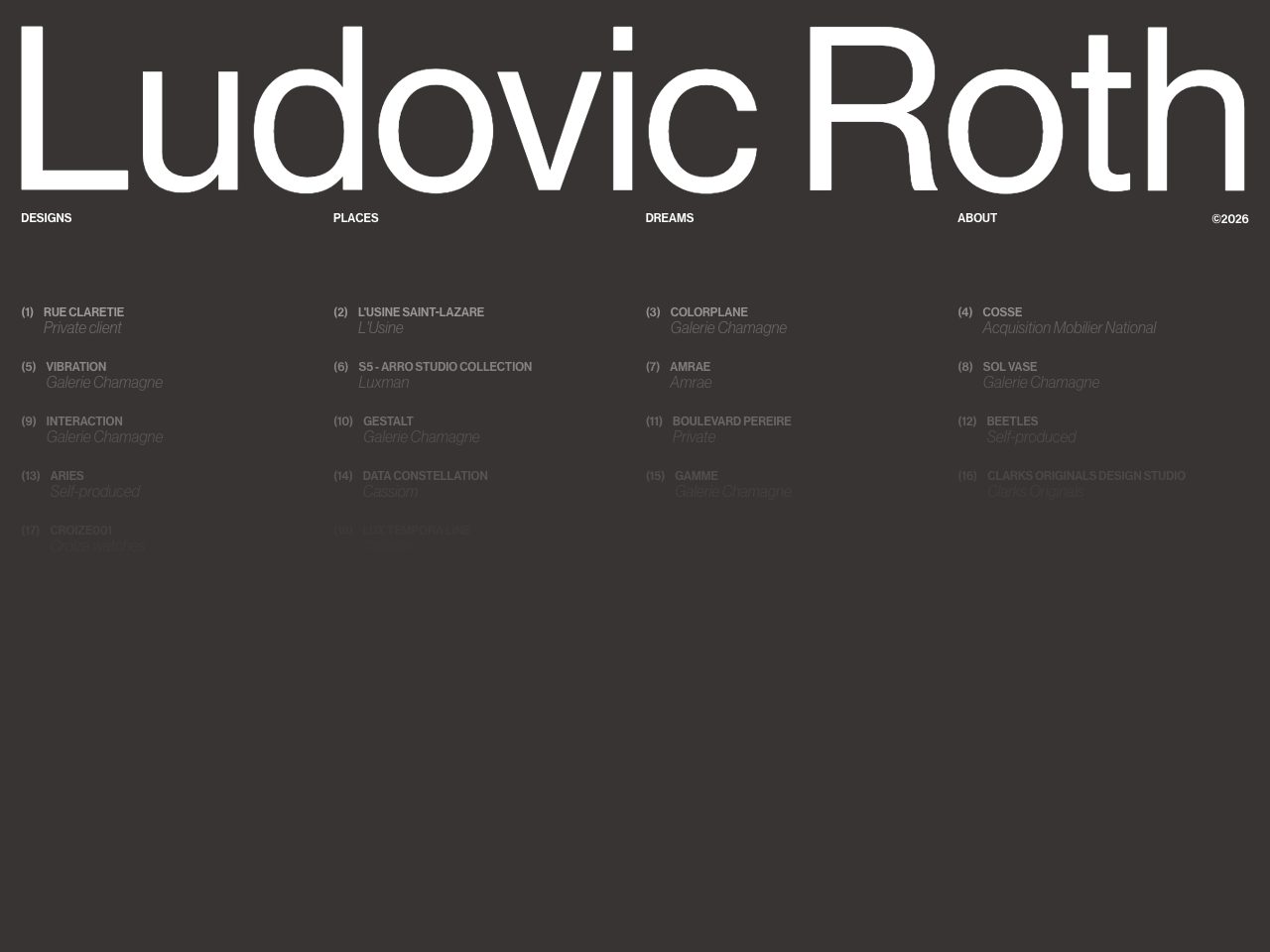
Ludovic Roth
Portfolio
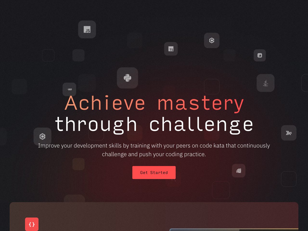
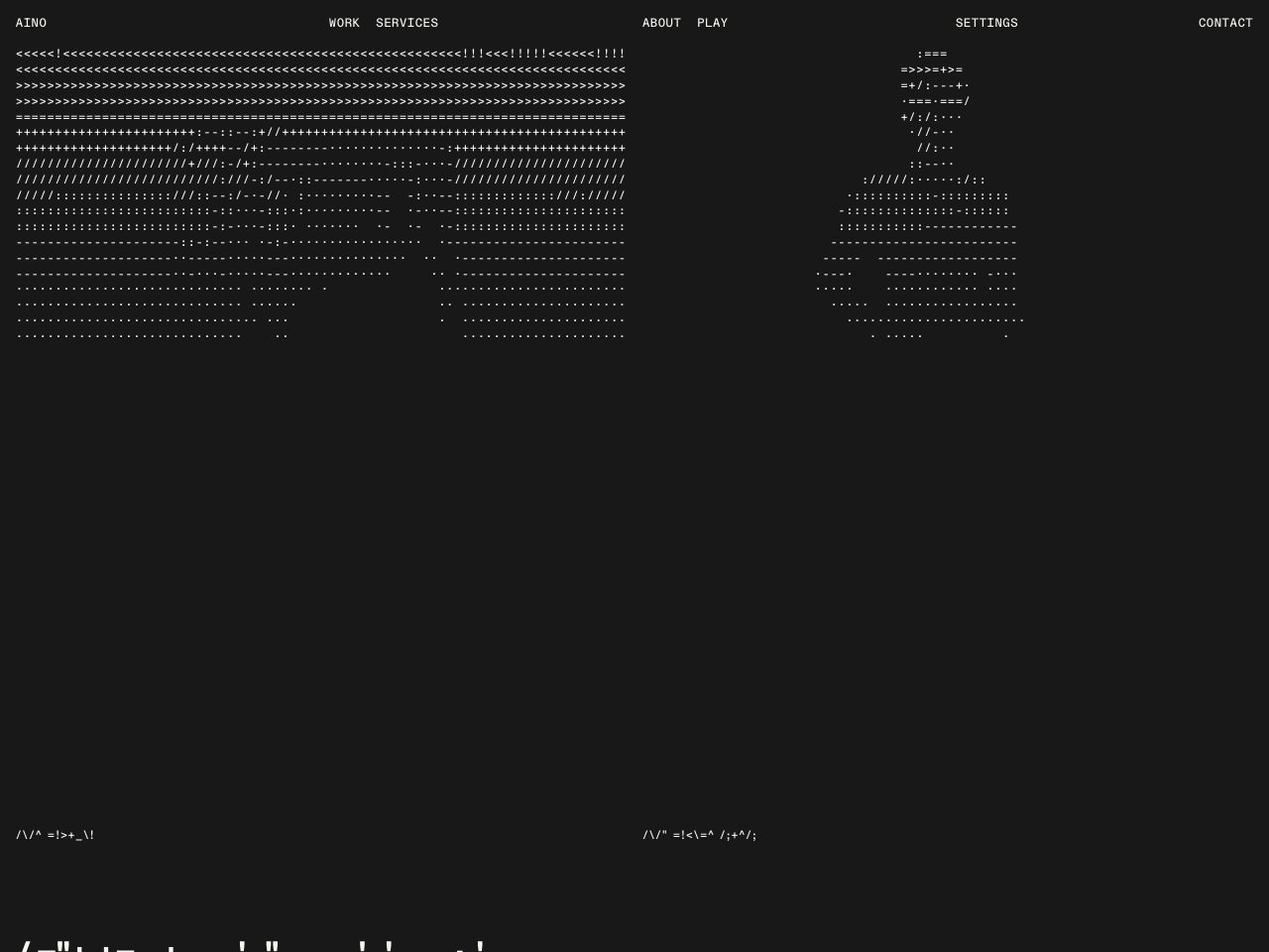
Aino Agency
Agency
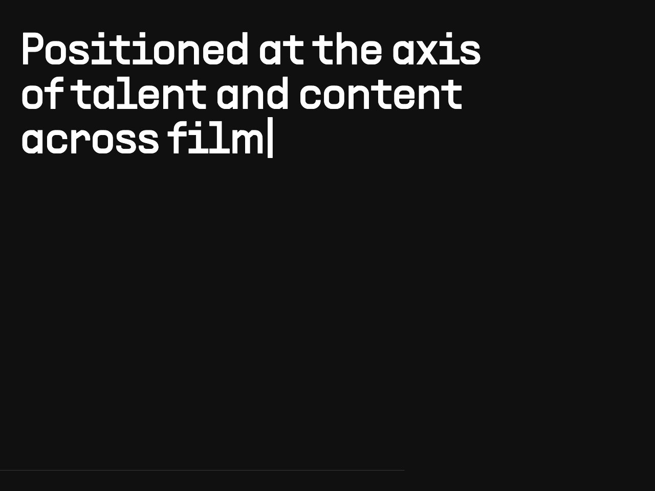
HLE
SaaS
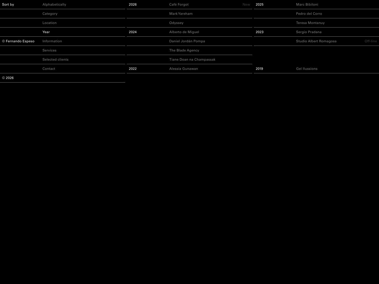
Fernando Espeso
Portfolio
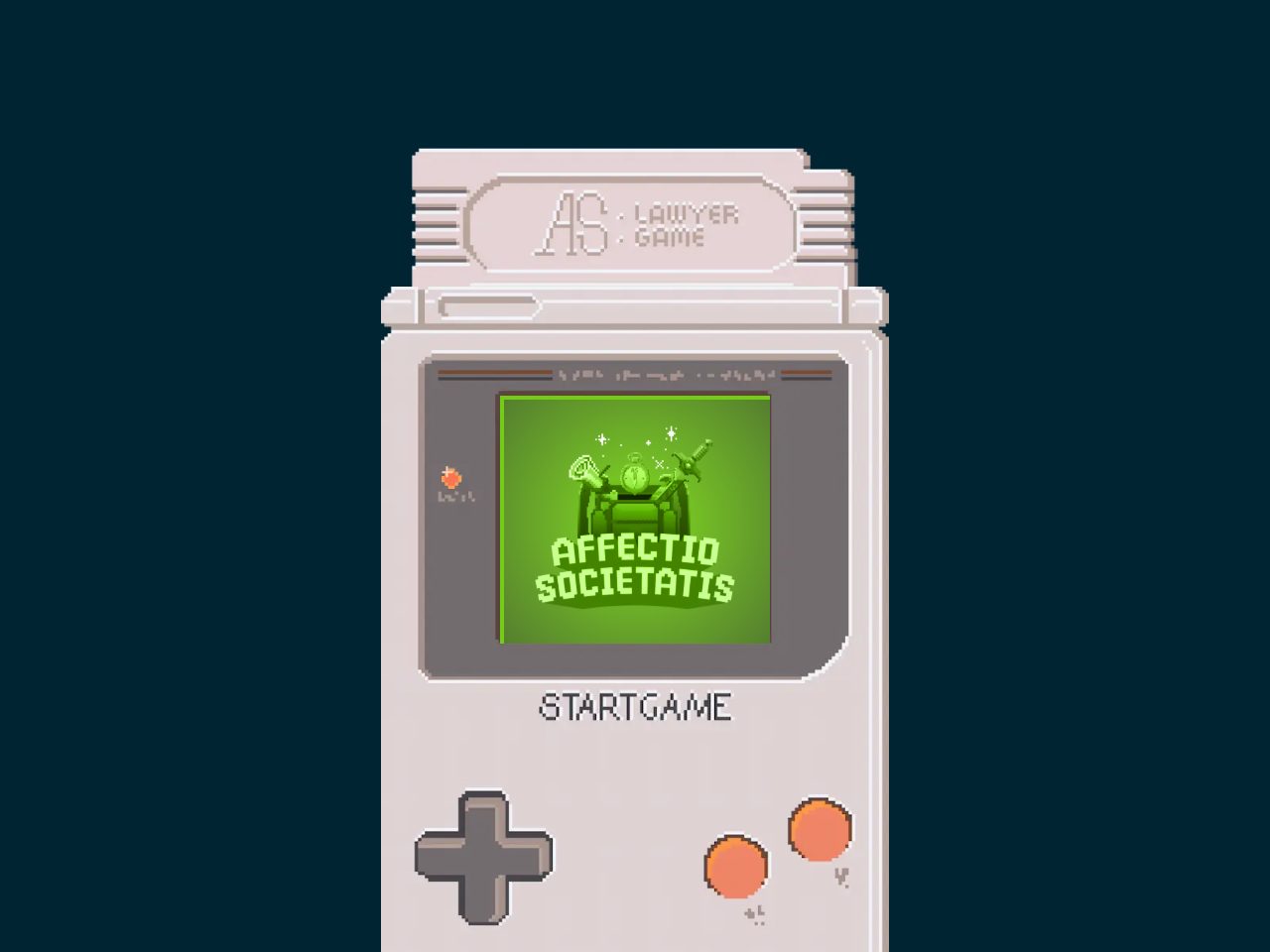
Affectio Societatis
Creative
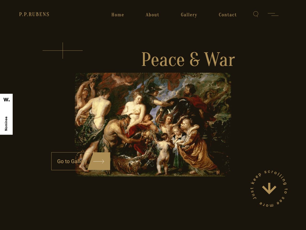
Rubens
Creative
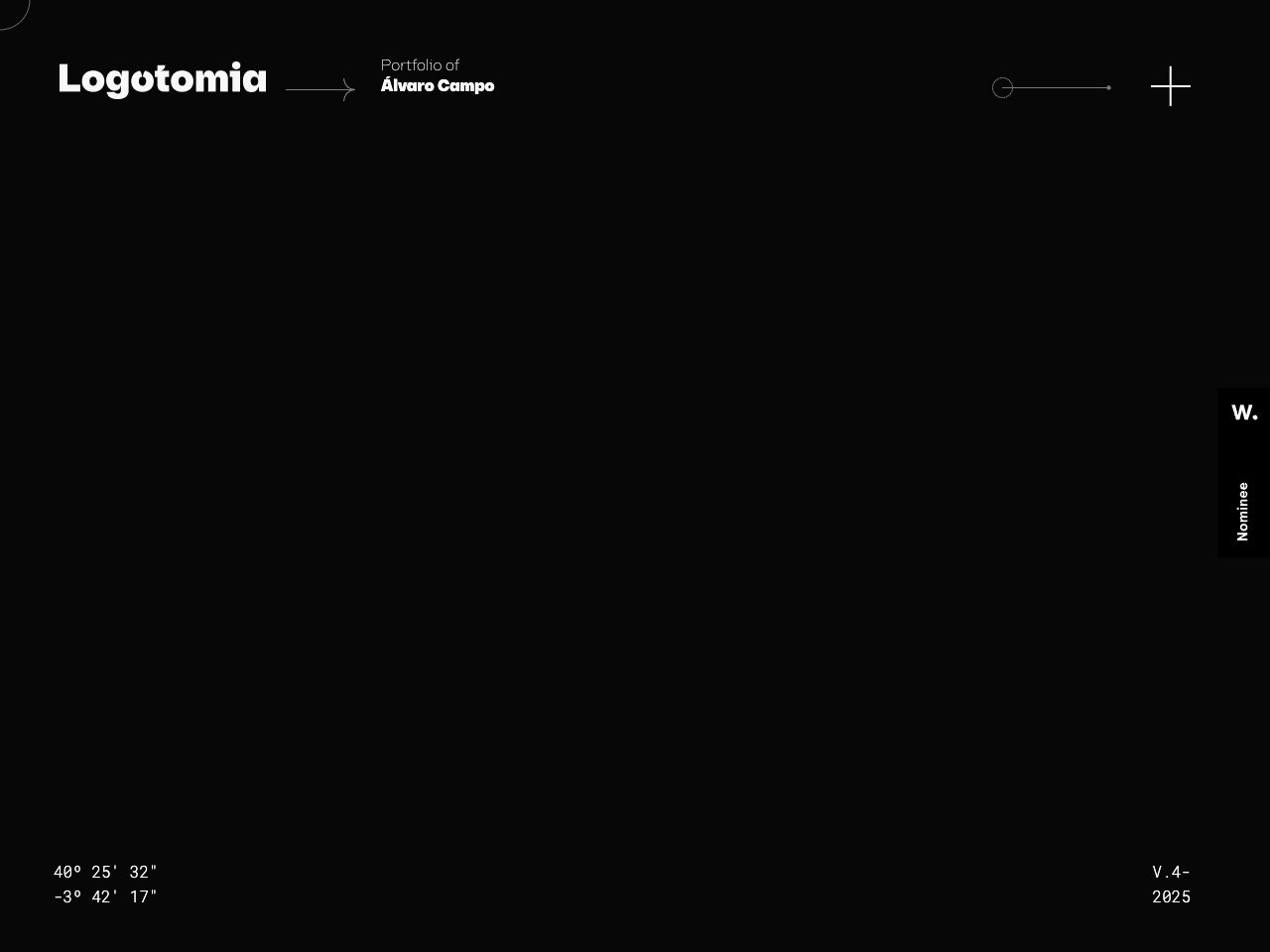
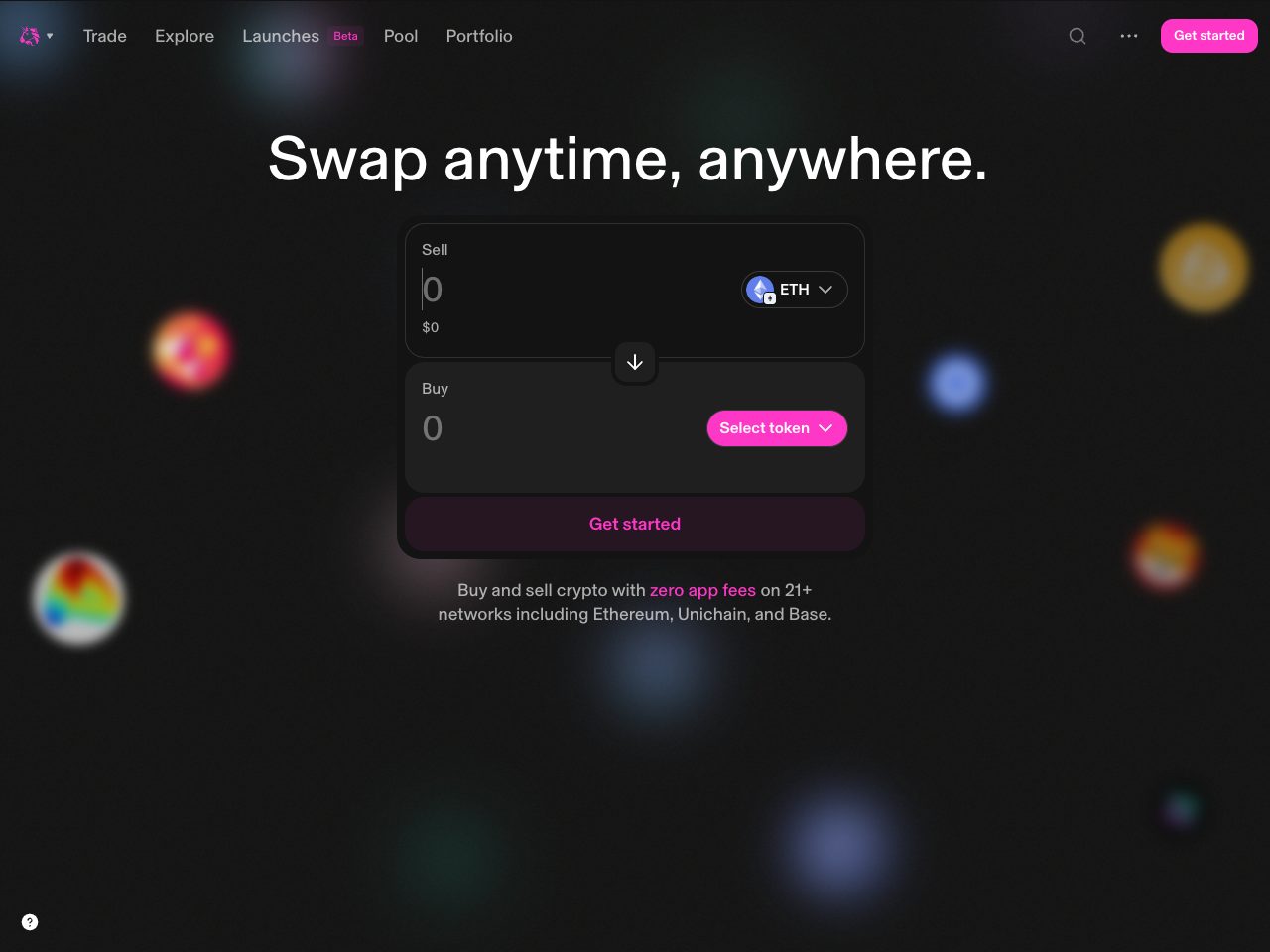
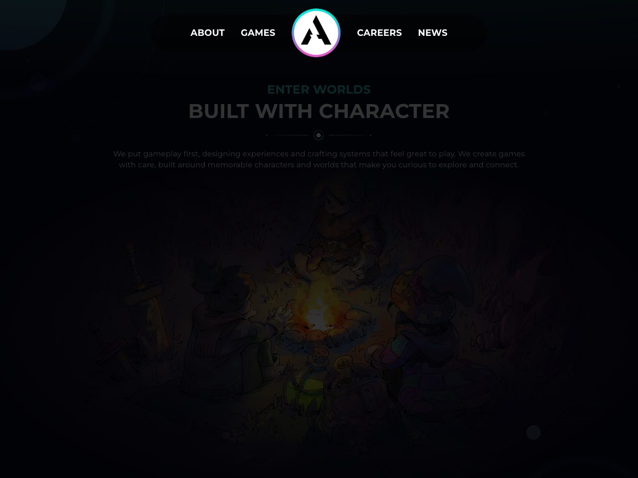
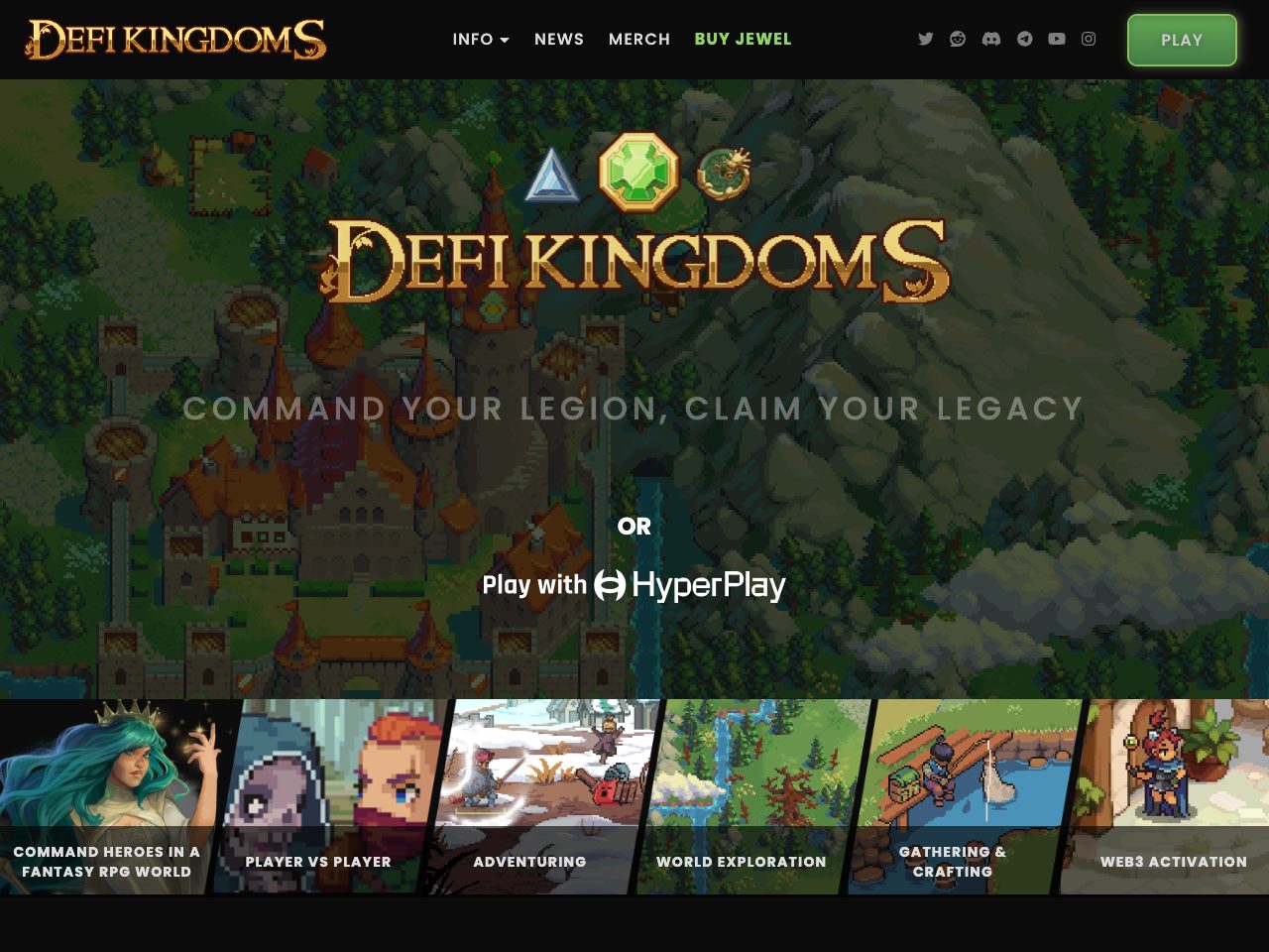
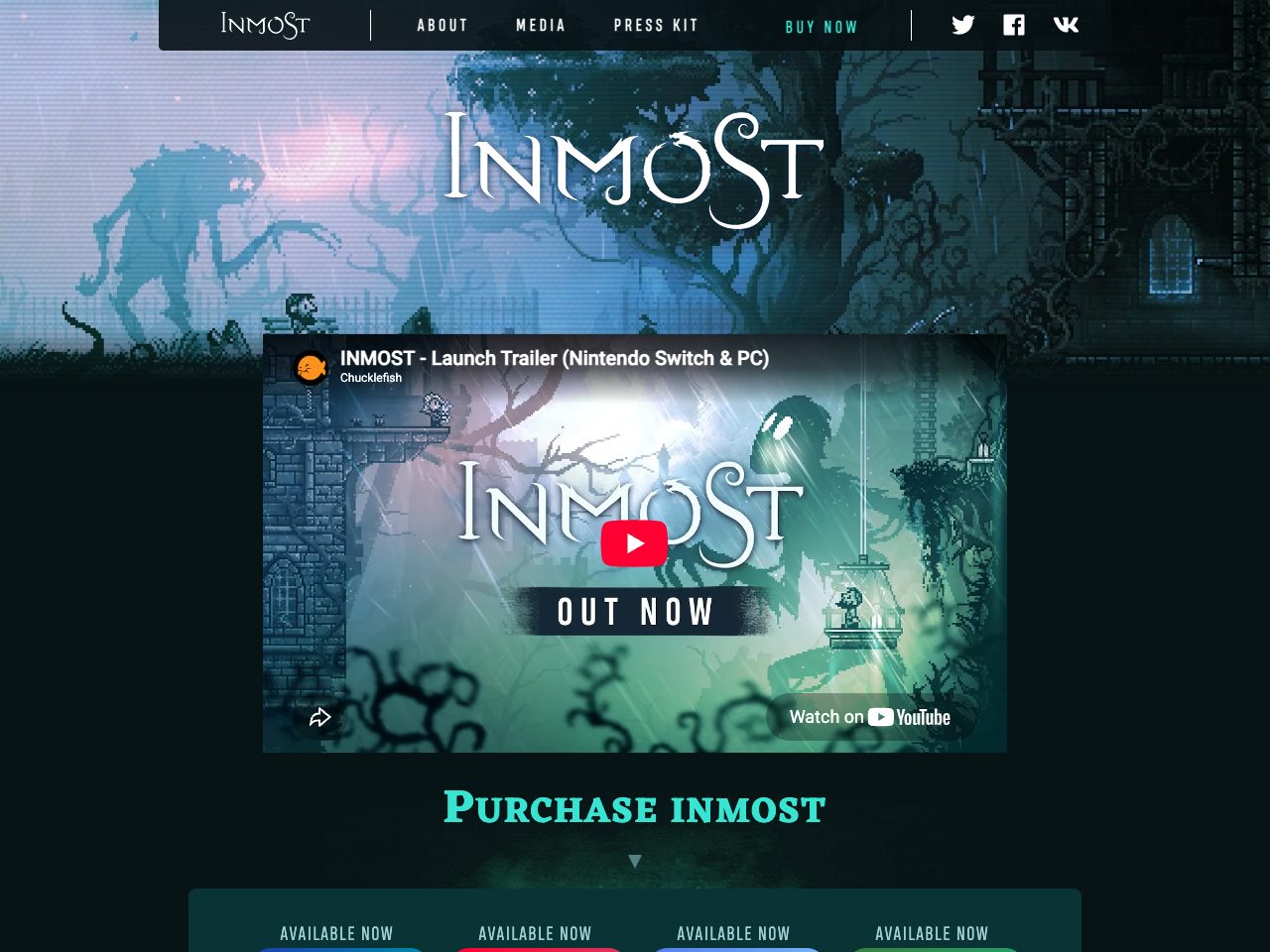
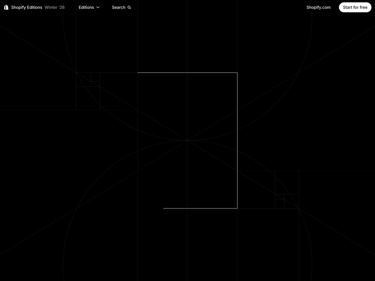
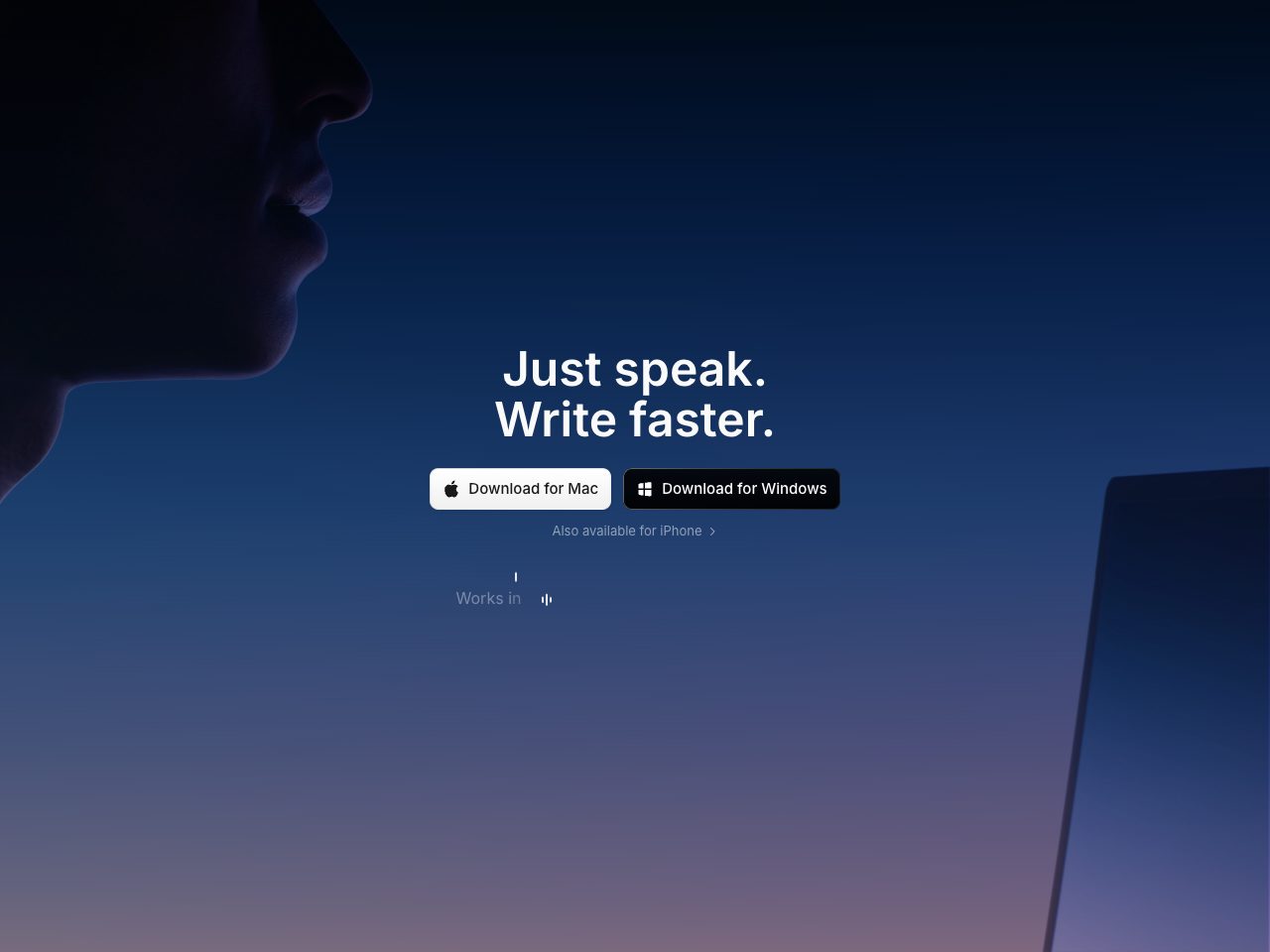
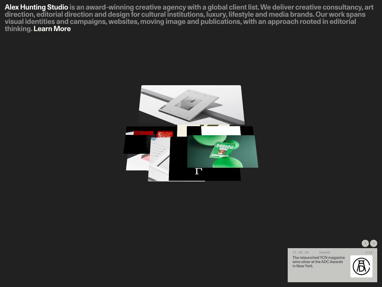
Alex Hunting
Portfolio
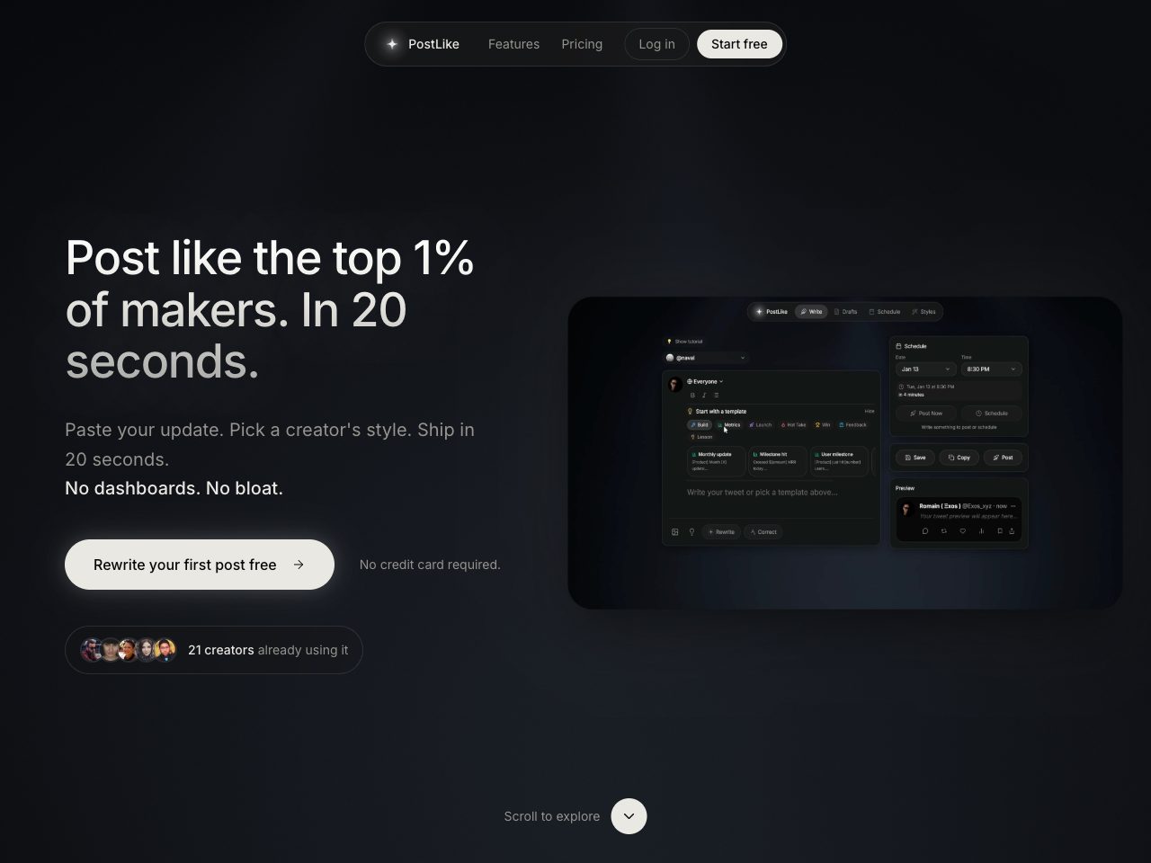
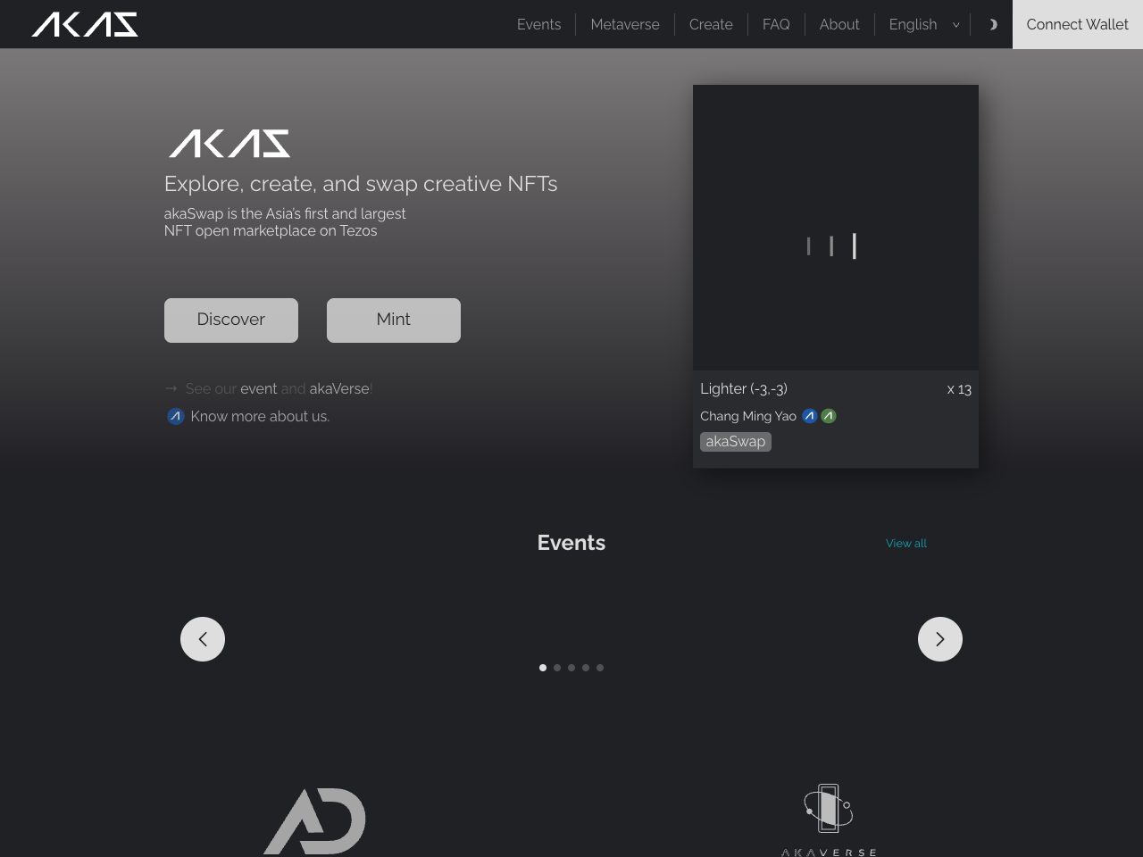
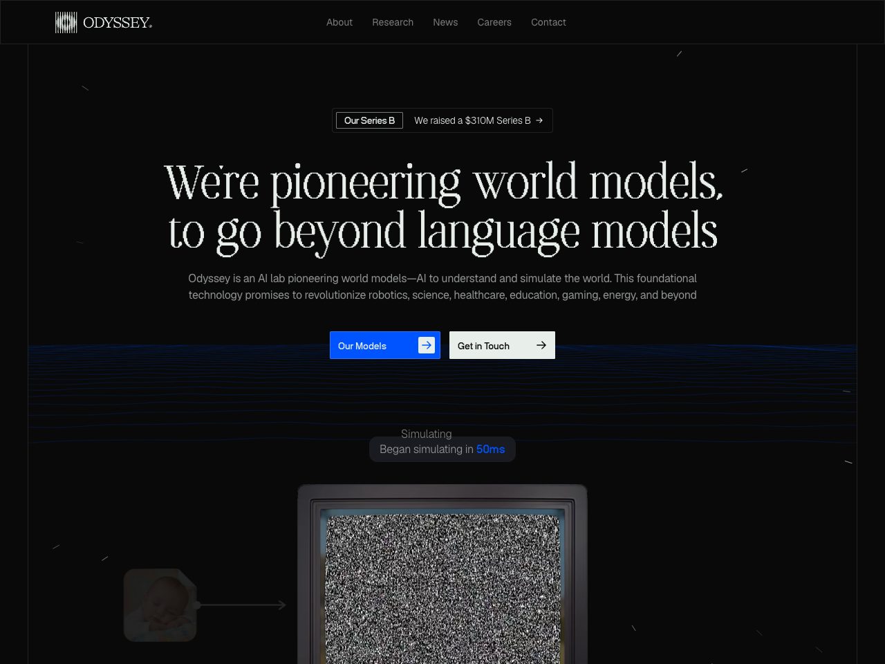
Odyssey
Creative
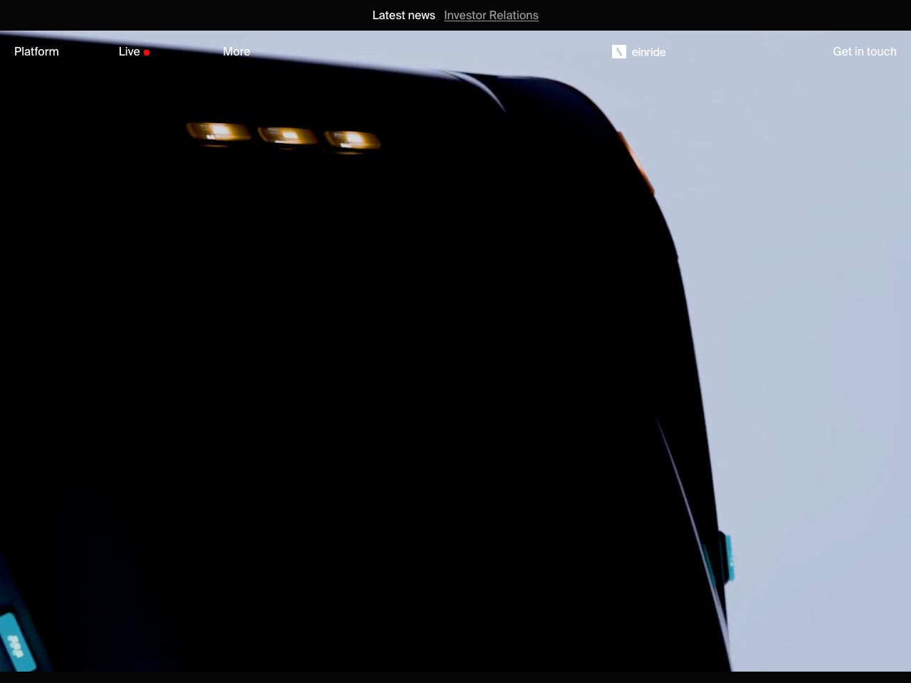
Einride
Creative
fxhash
Creative
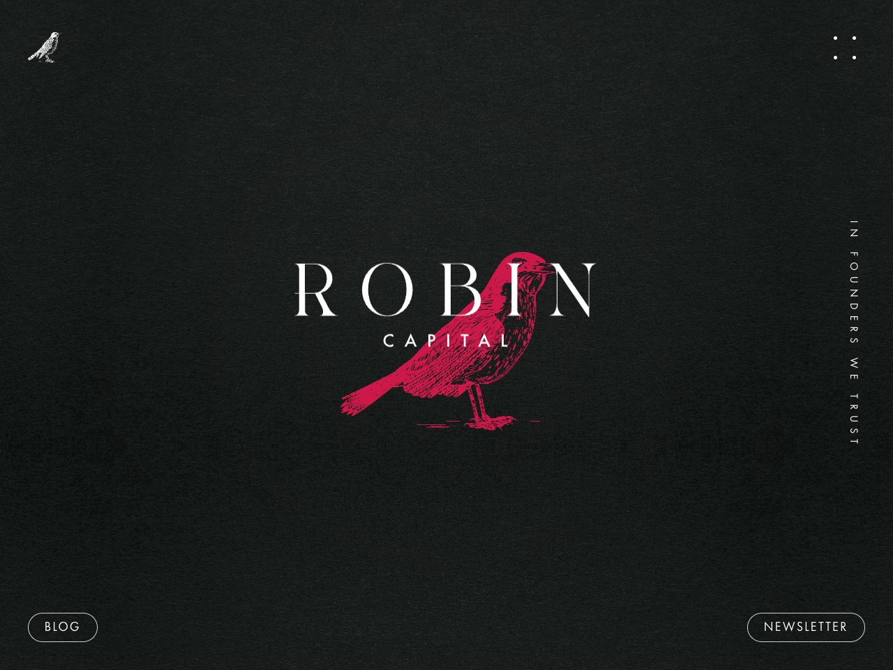
Robin Capital
Startup
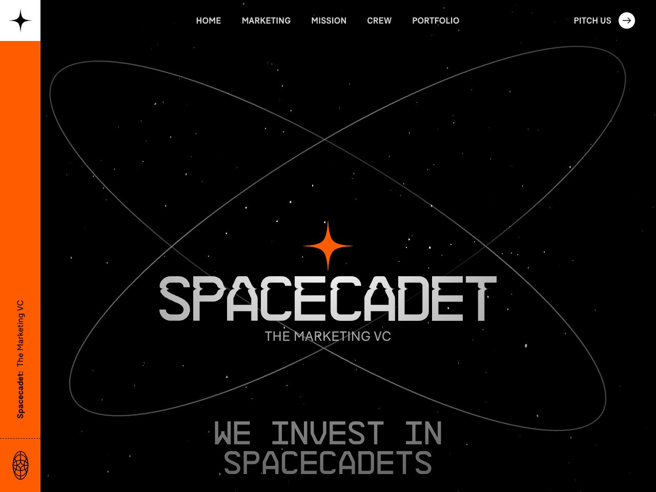
Spacecadet
Creative
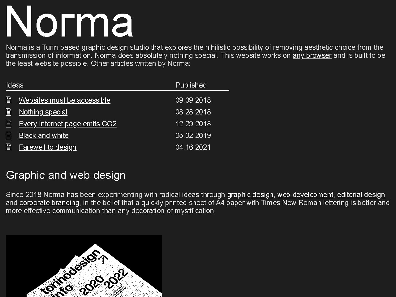
Norma
Agency
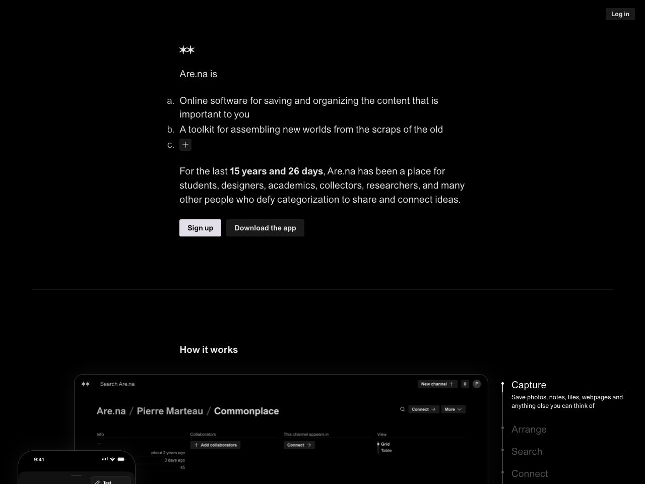
Are
SaaS
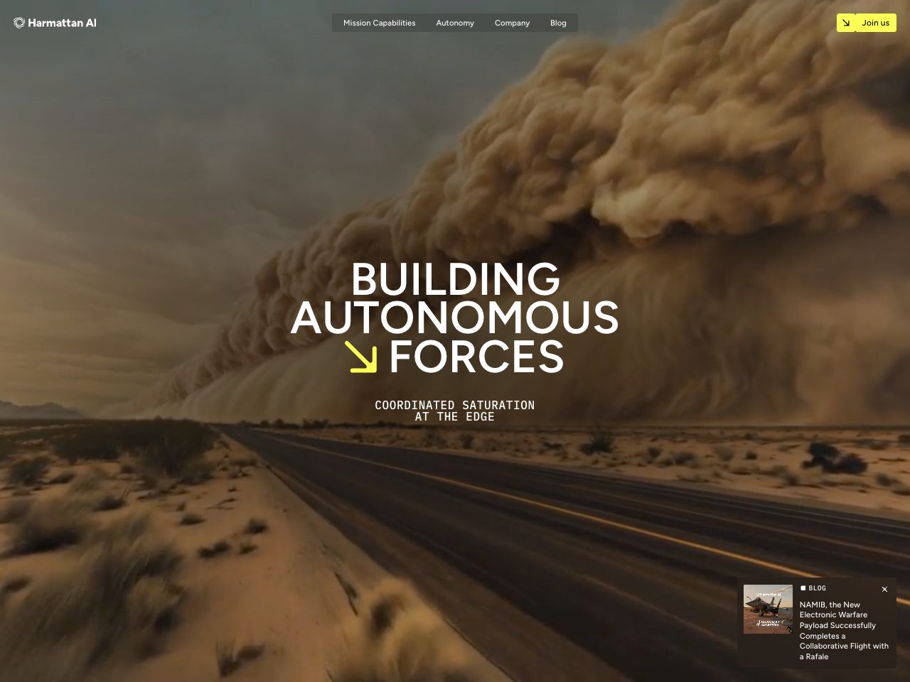
Harmattan
Startup
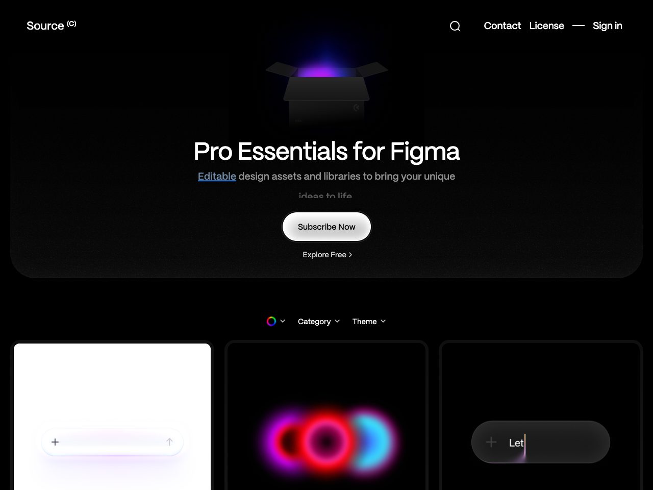
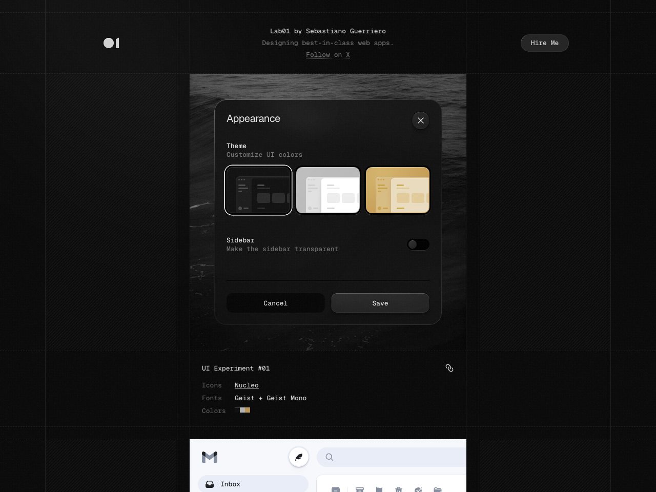
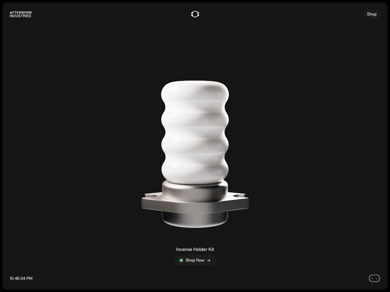
Madeafterwork
Creative
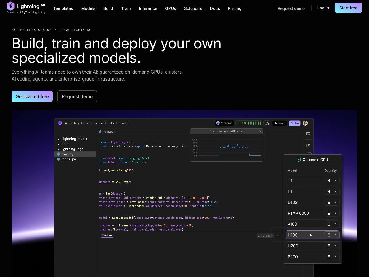
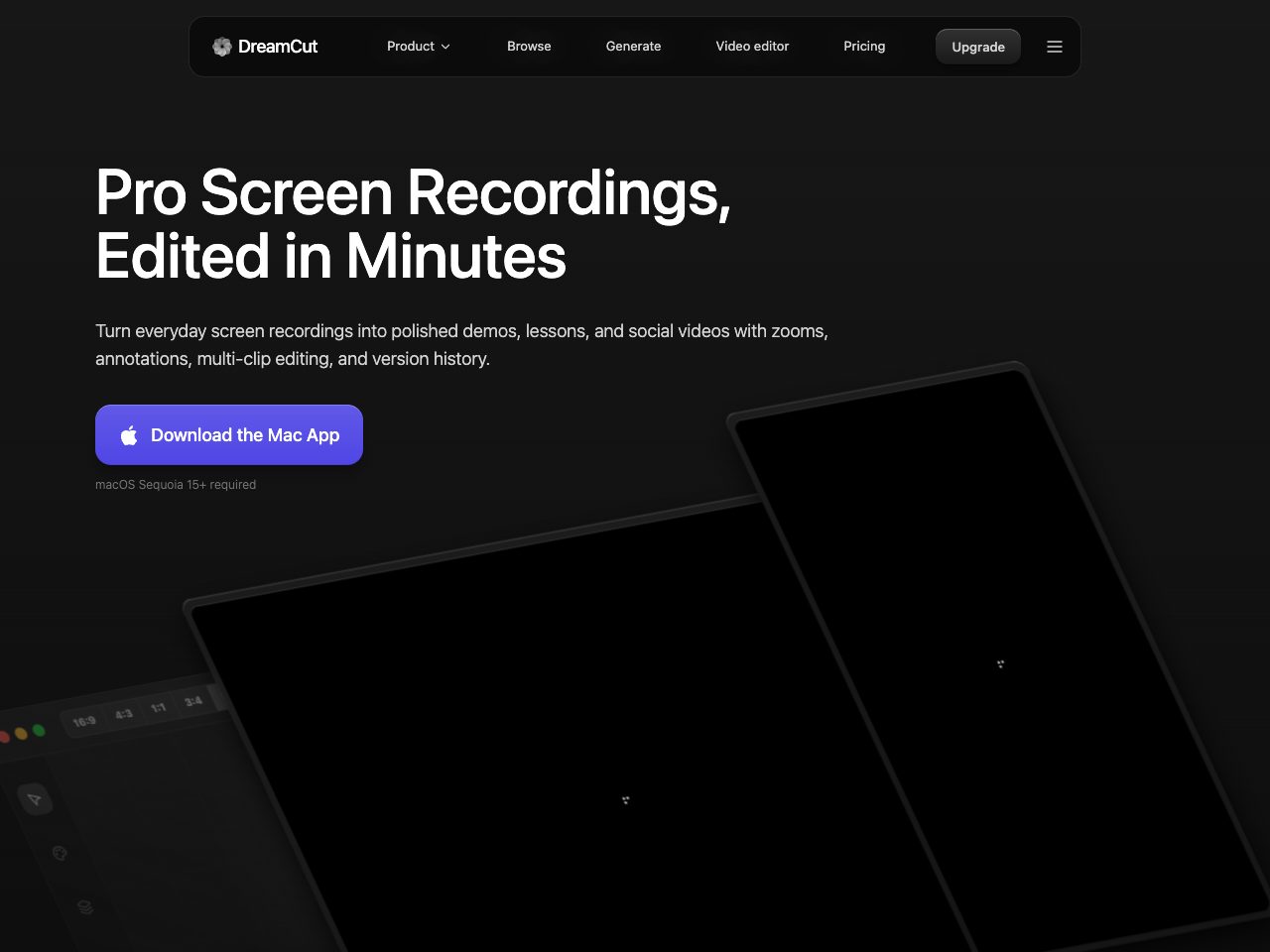
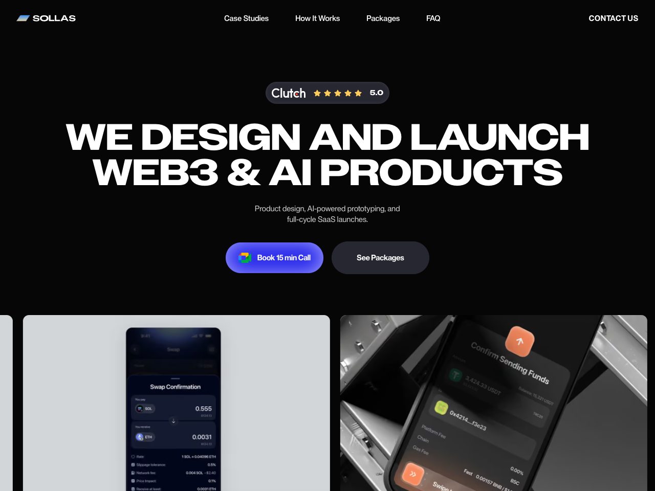
Sollas
Agency
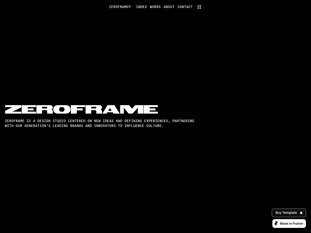
Zeroframe
Creative
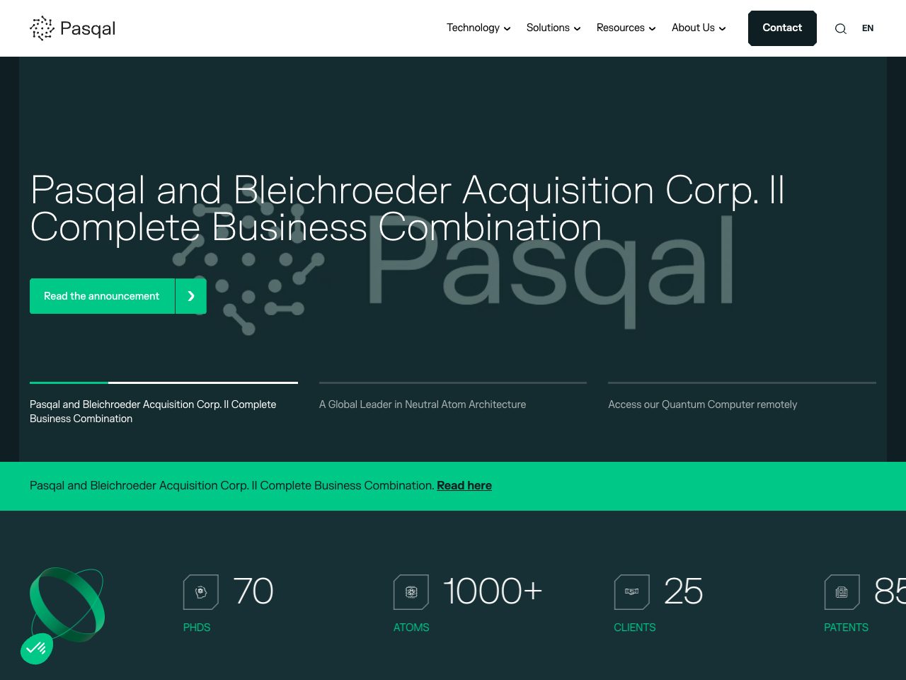
Pasqal
Startup
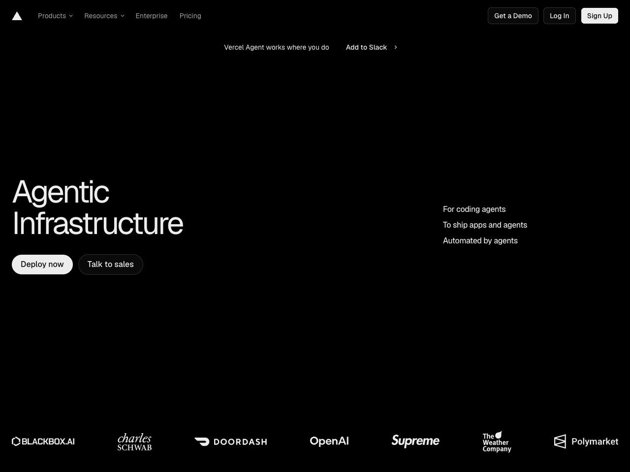
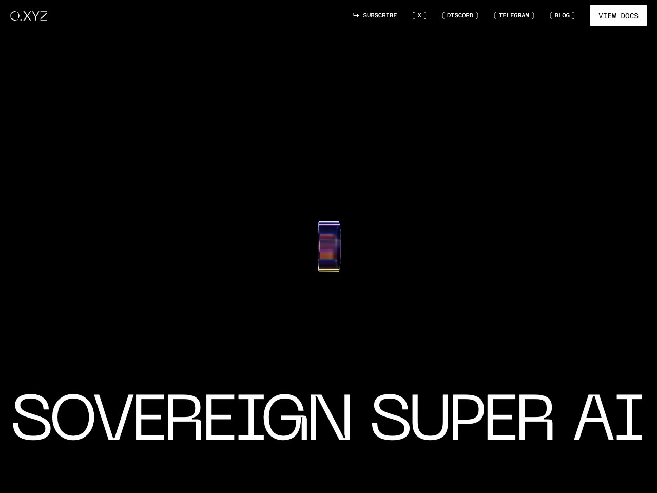
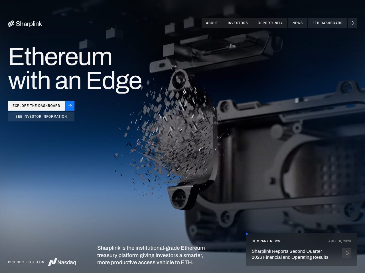
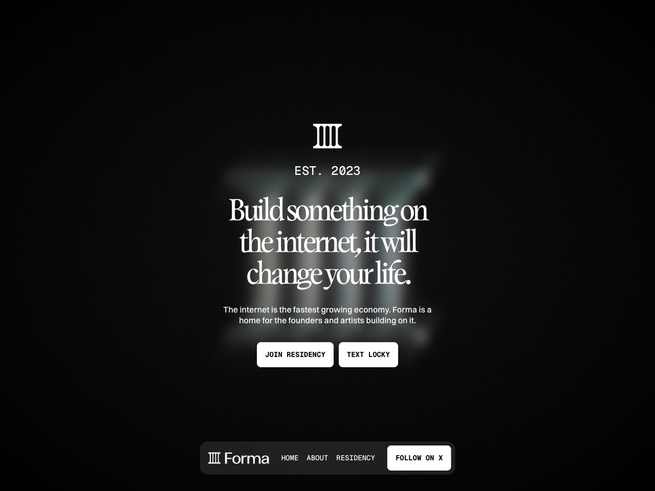
Forma
Startup
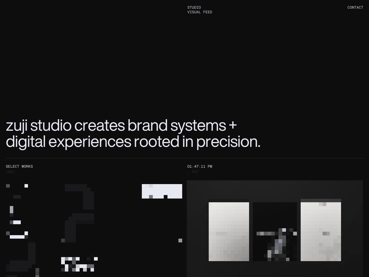
zuji studio
Agency
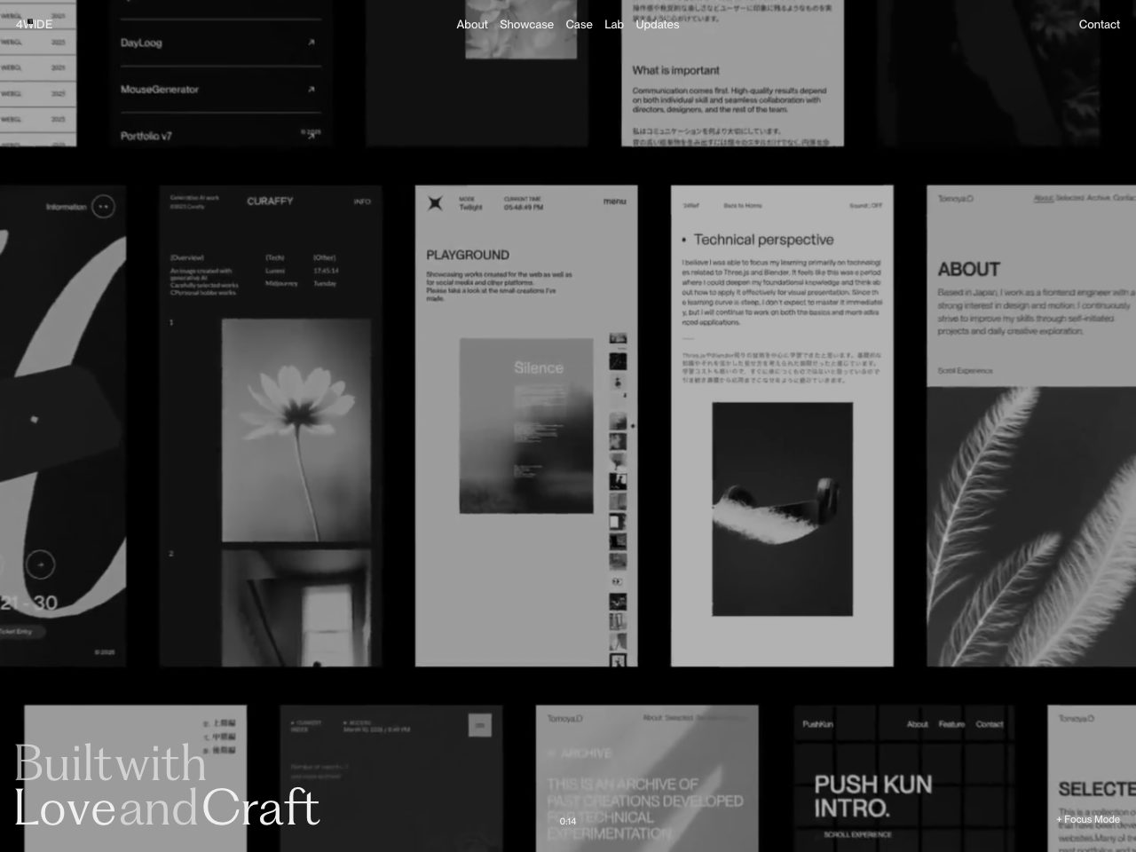
4WIDE
Agency
Malvah Studio
Agency
21 TSI
Startup
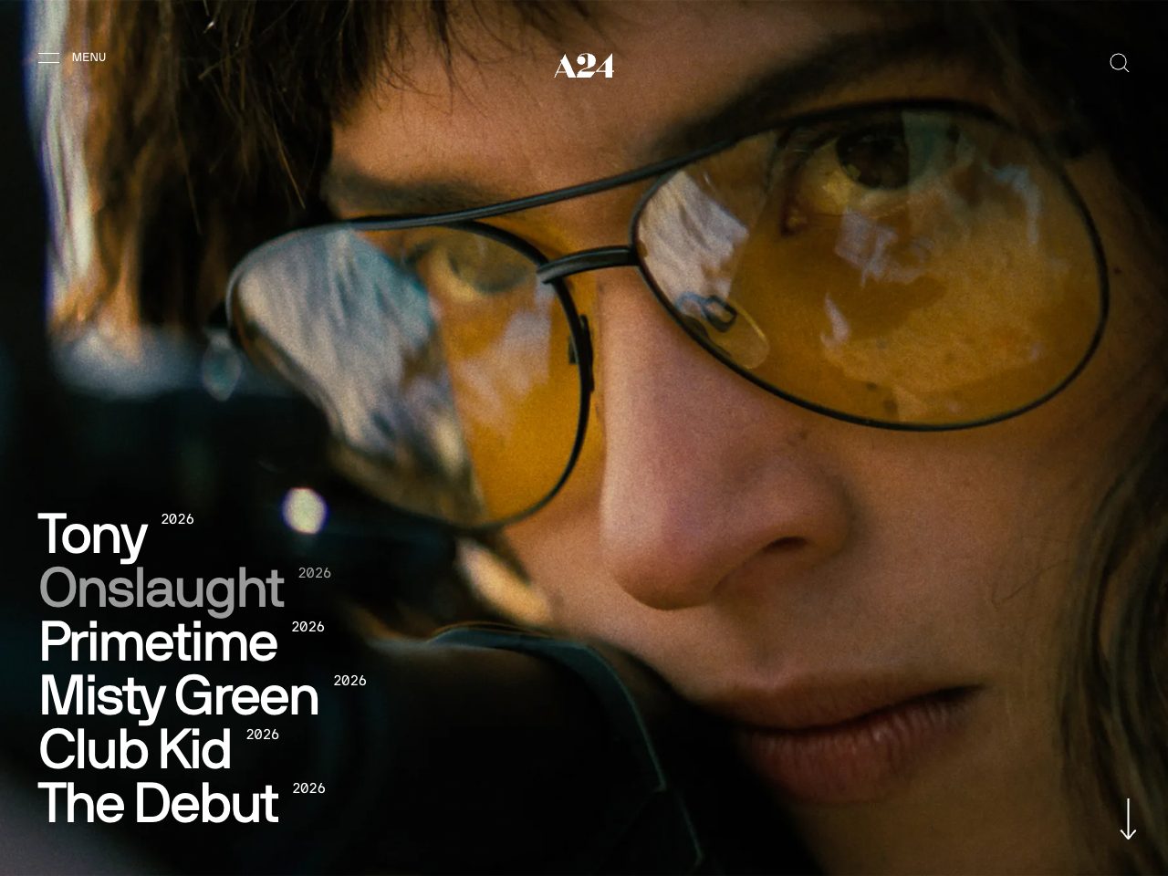
A24
Creative
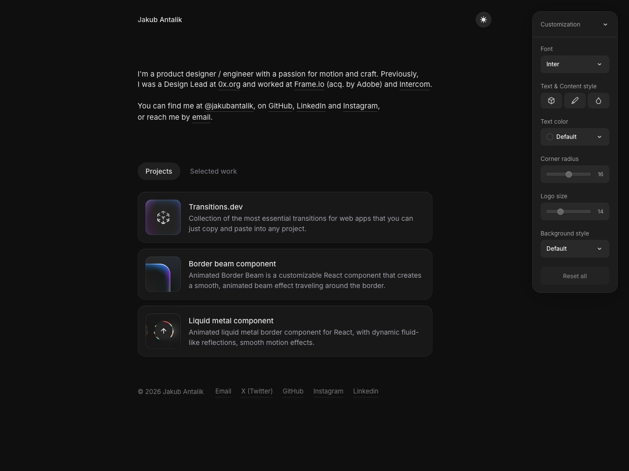
Jakub Antalik
Portfolio
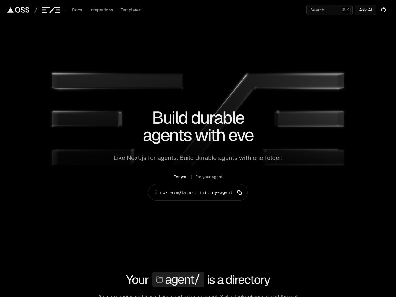
Eve
SaaS
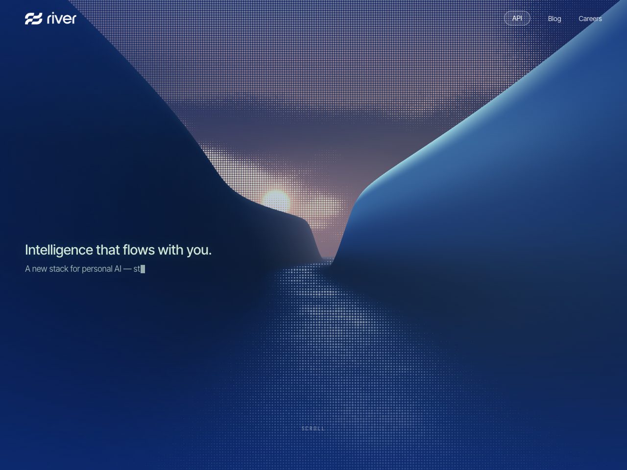
River
SaaS
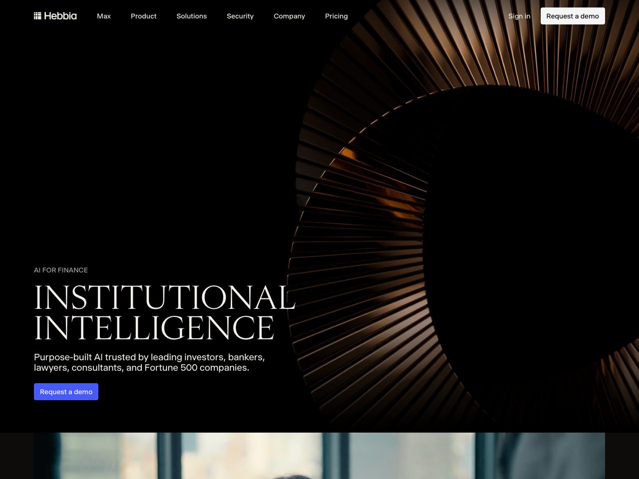
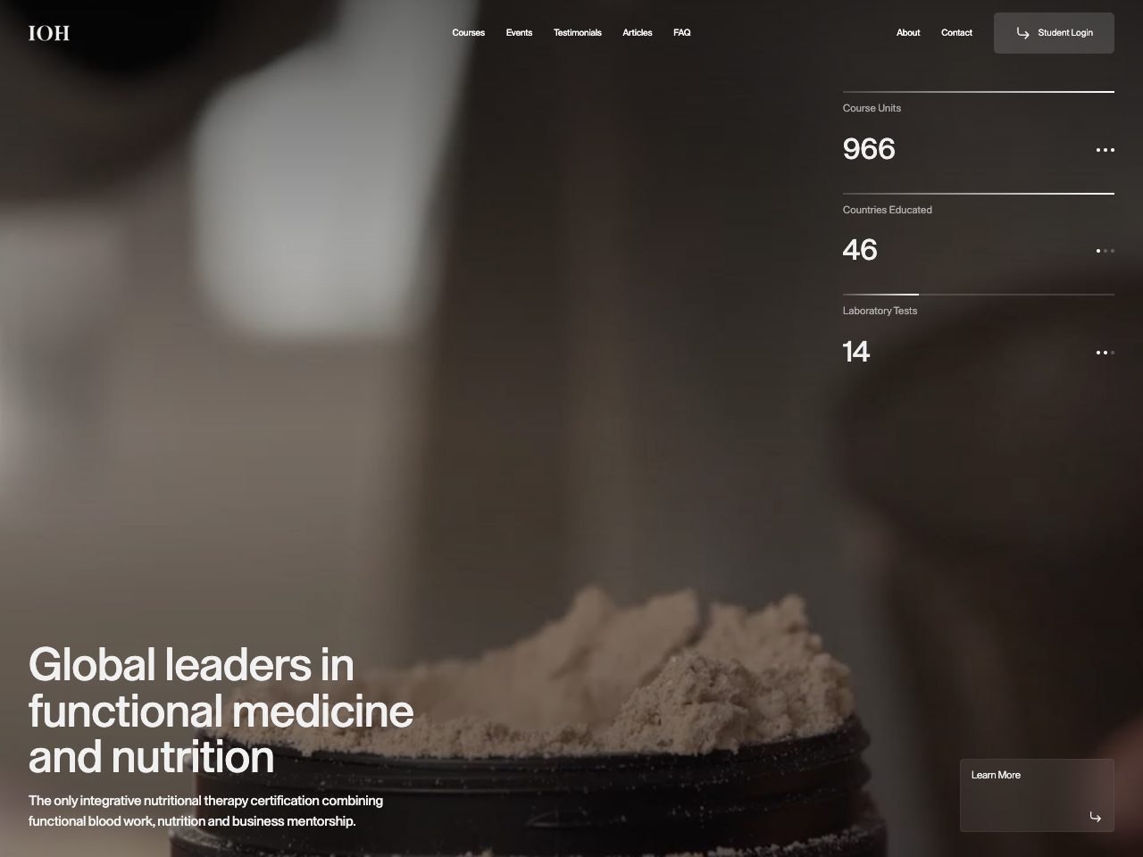
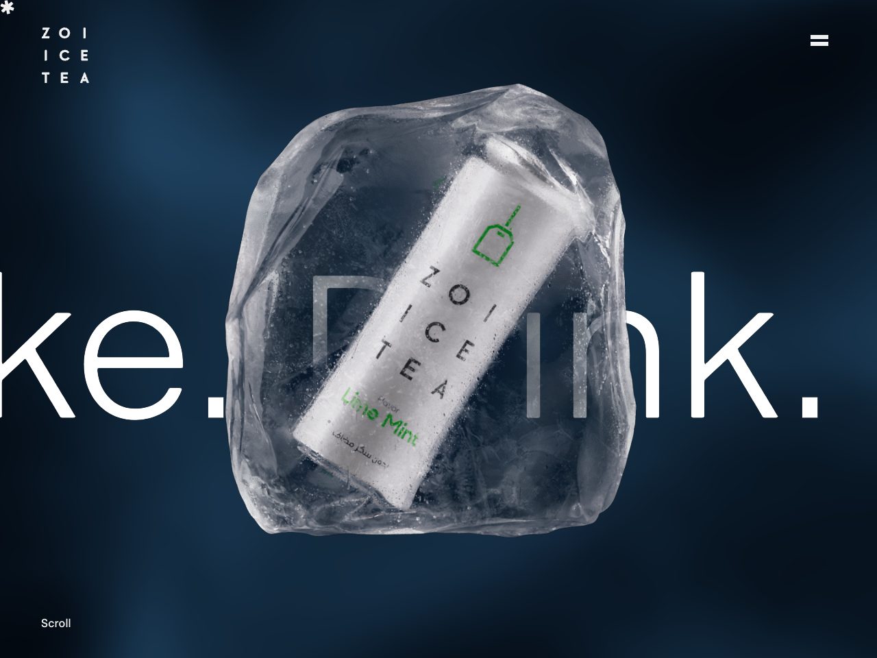
Zoi
Startup
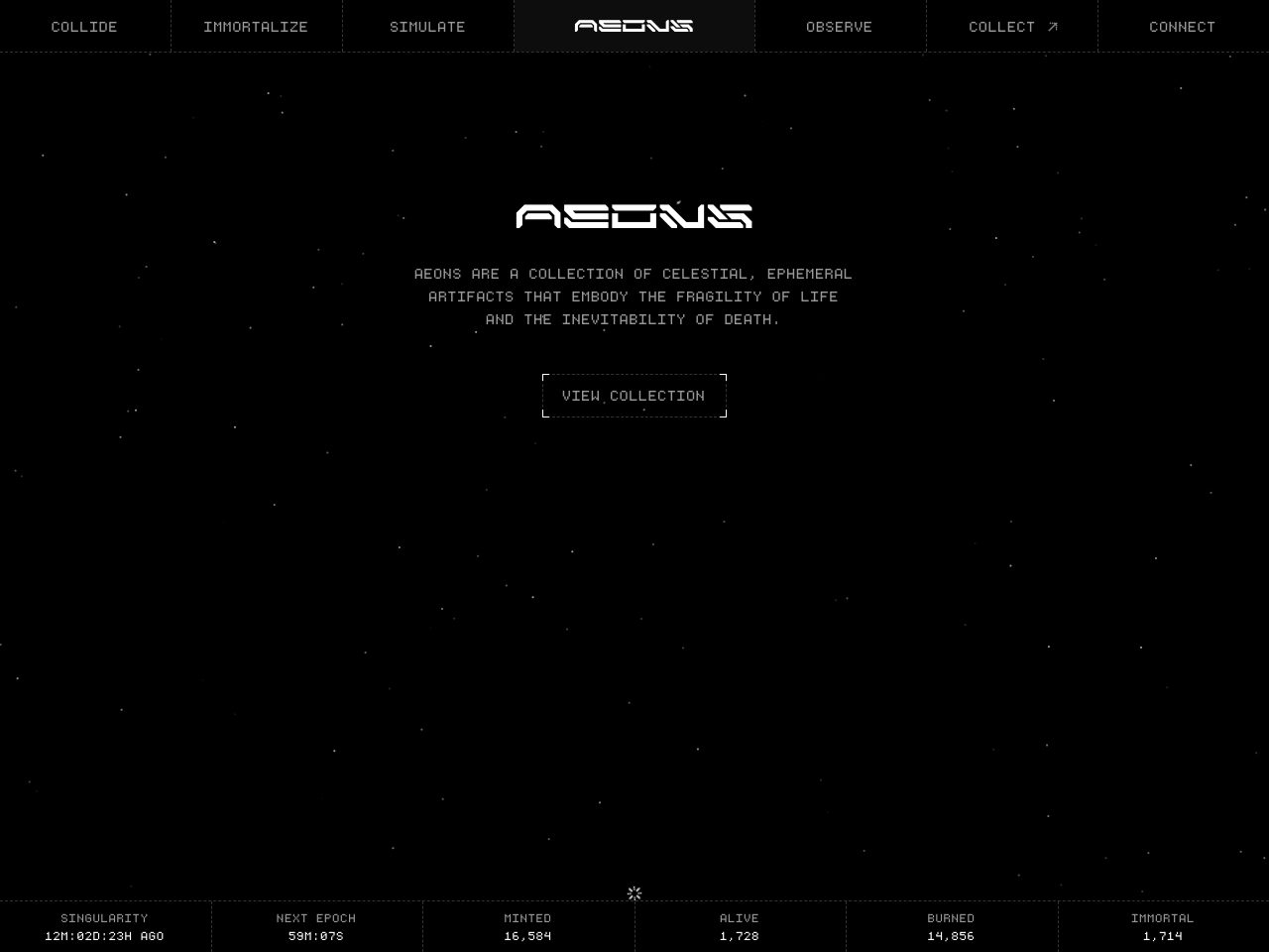
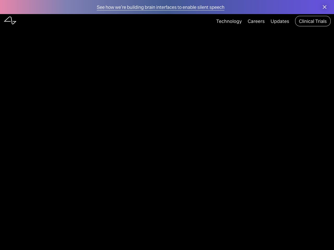
Neuralink
Startup
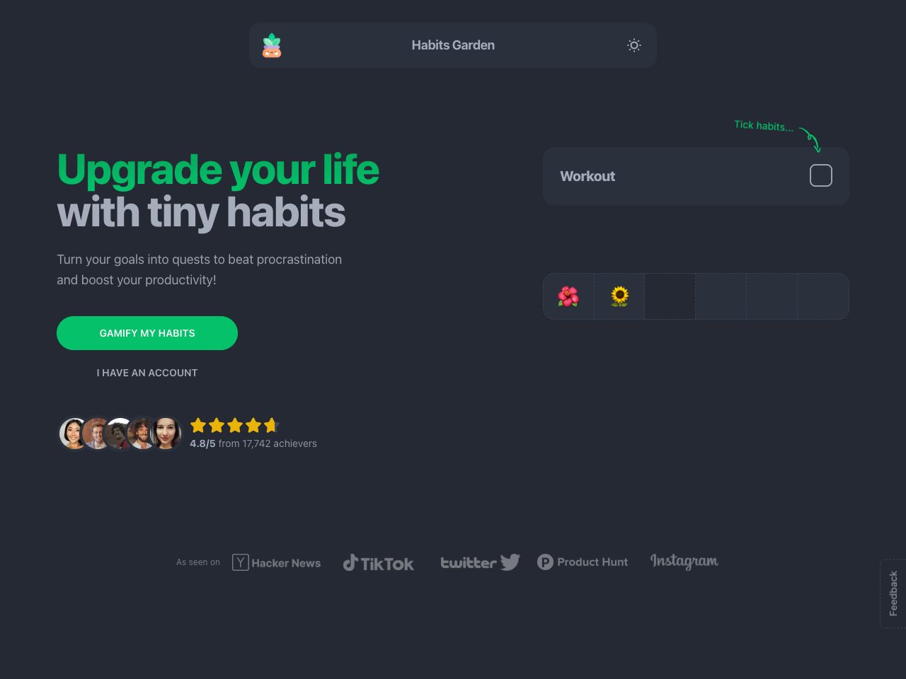
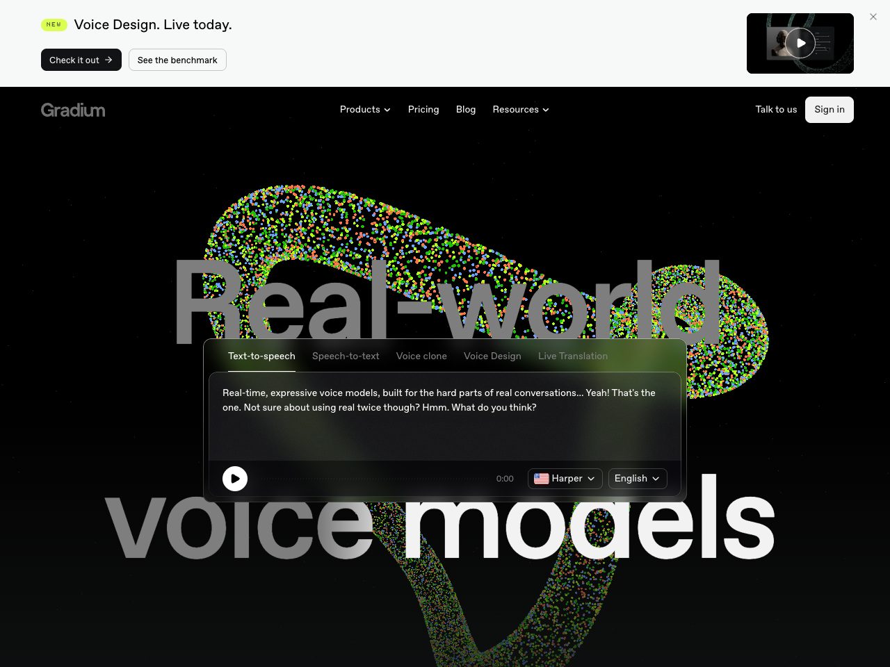
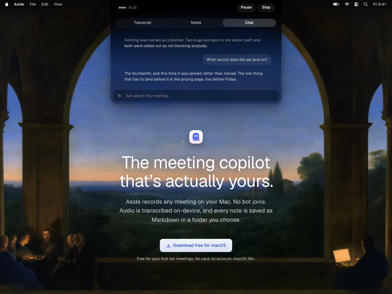
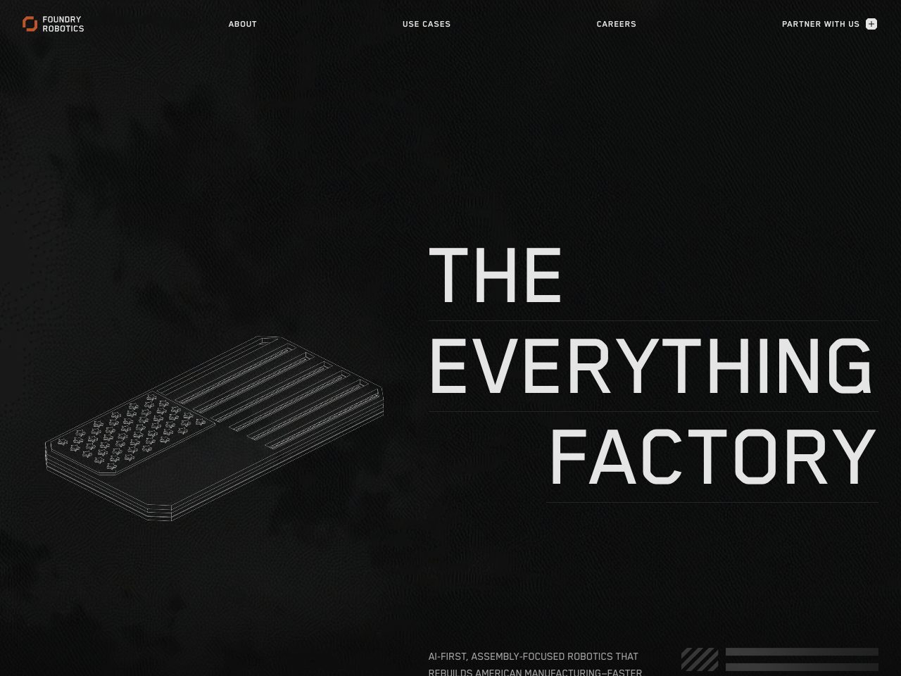
Foundry Robotics
Startup
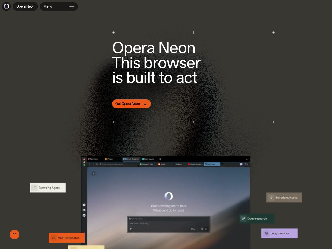
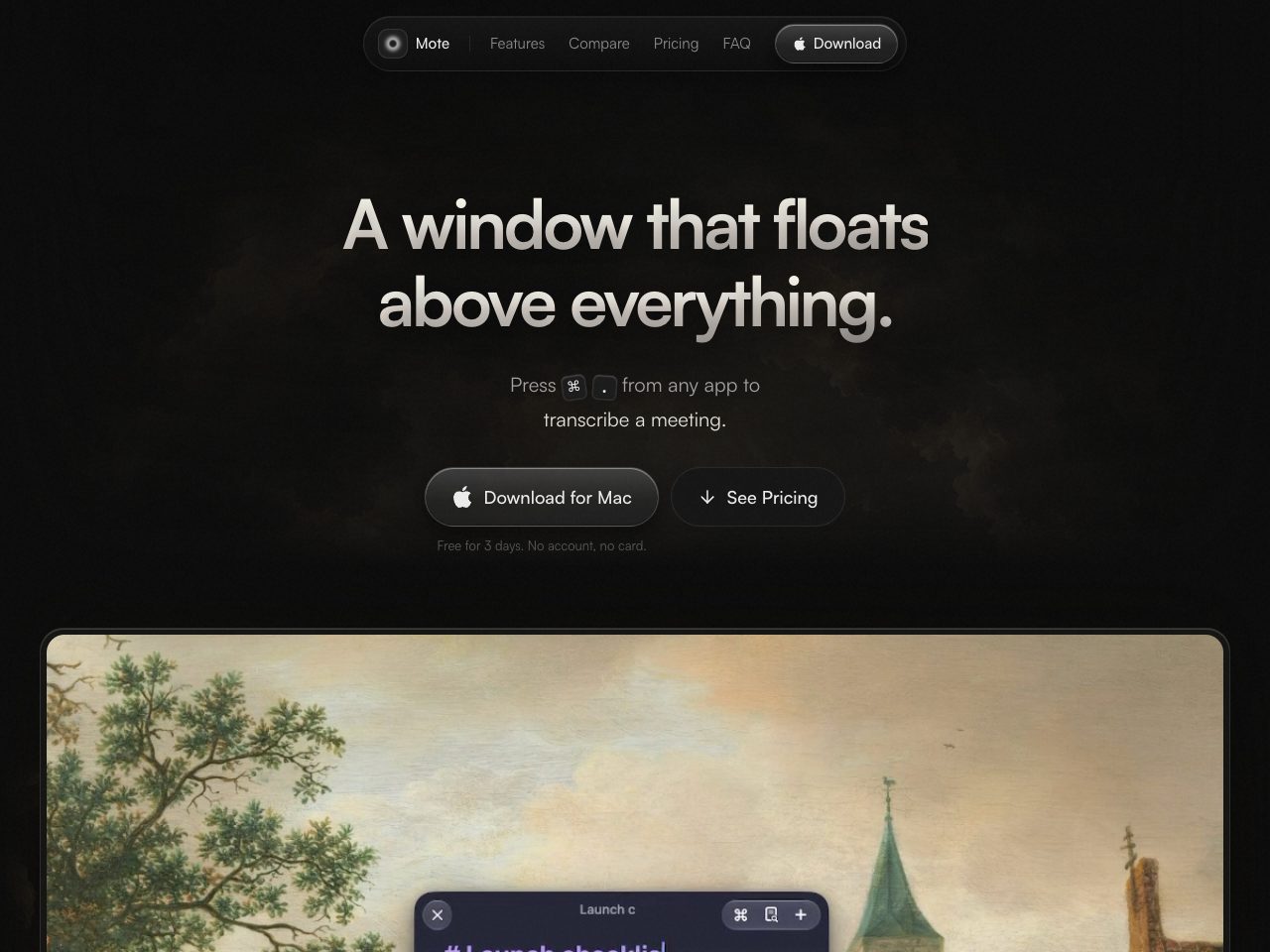
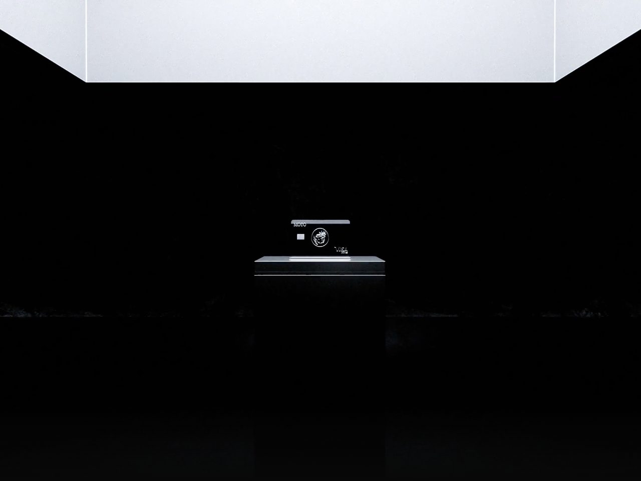
Mote
SaaS
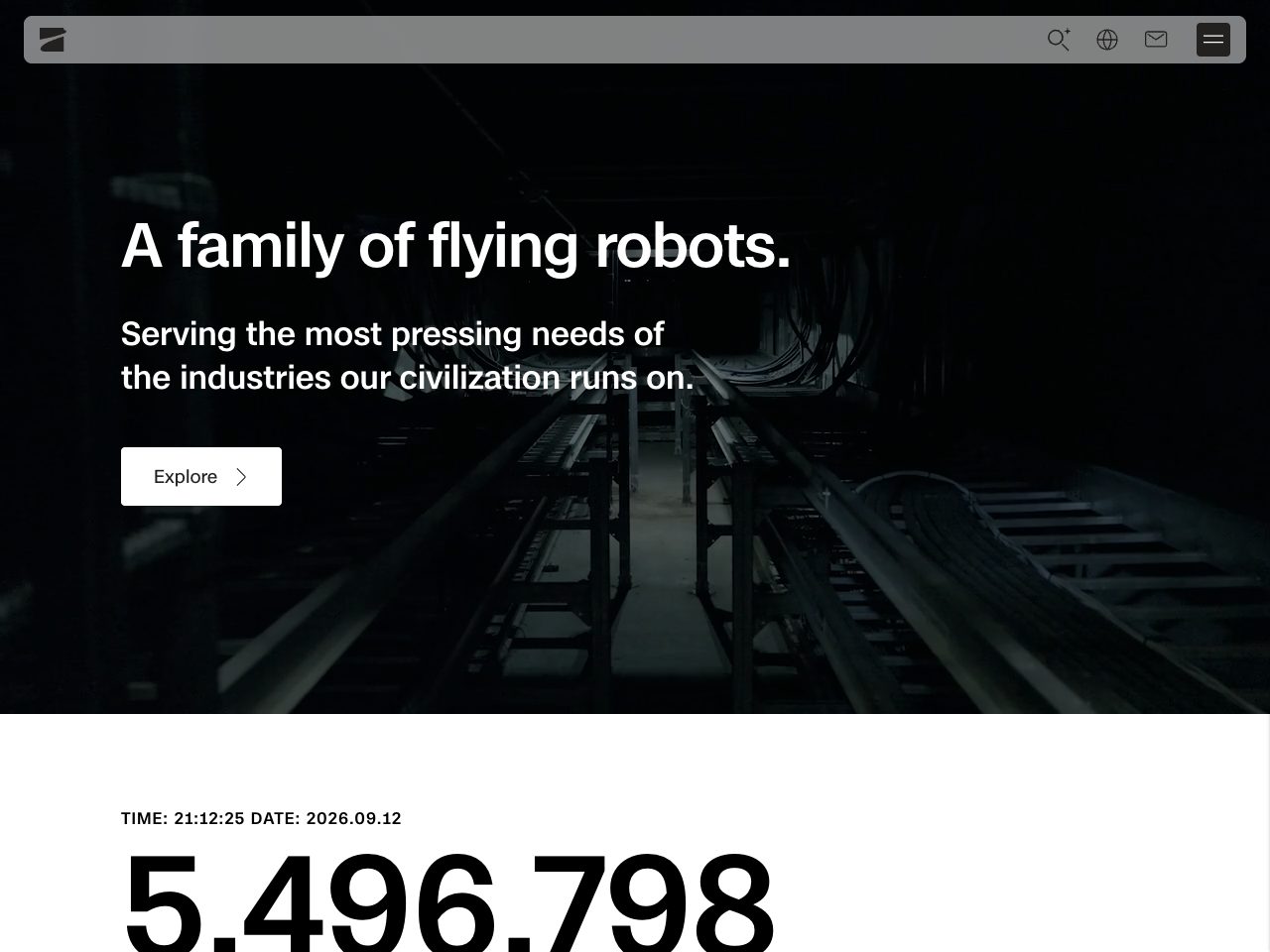
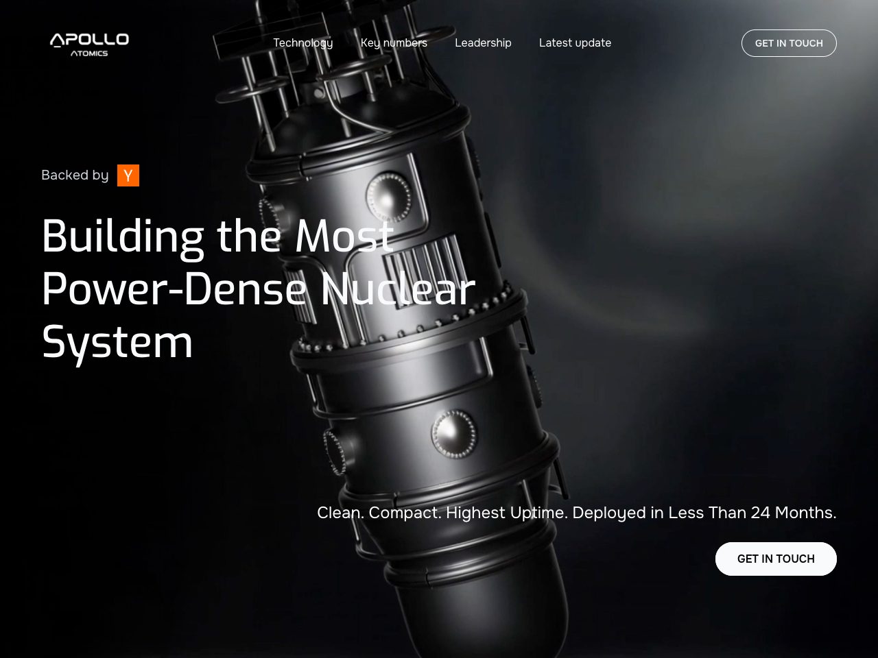
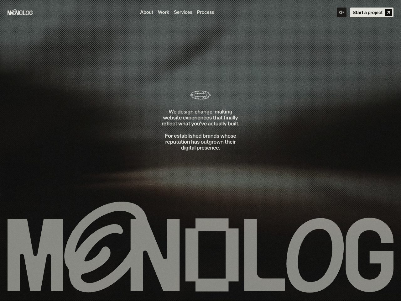
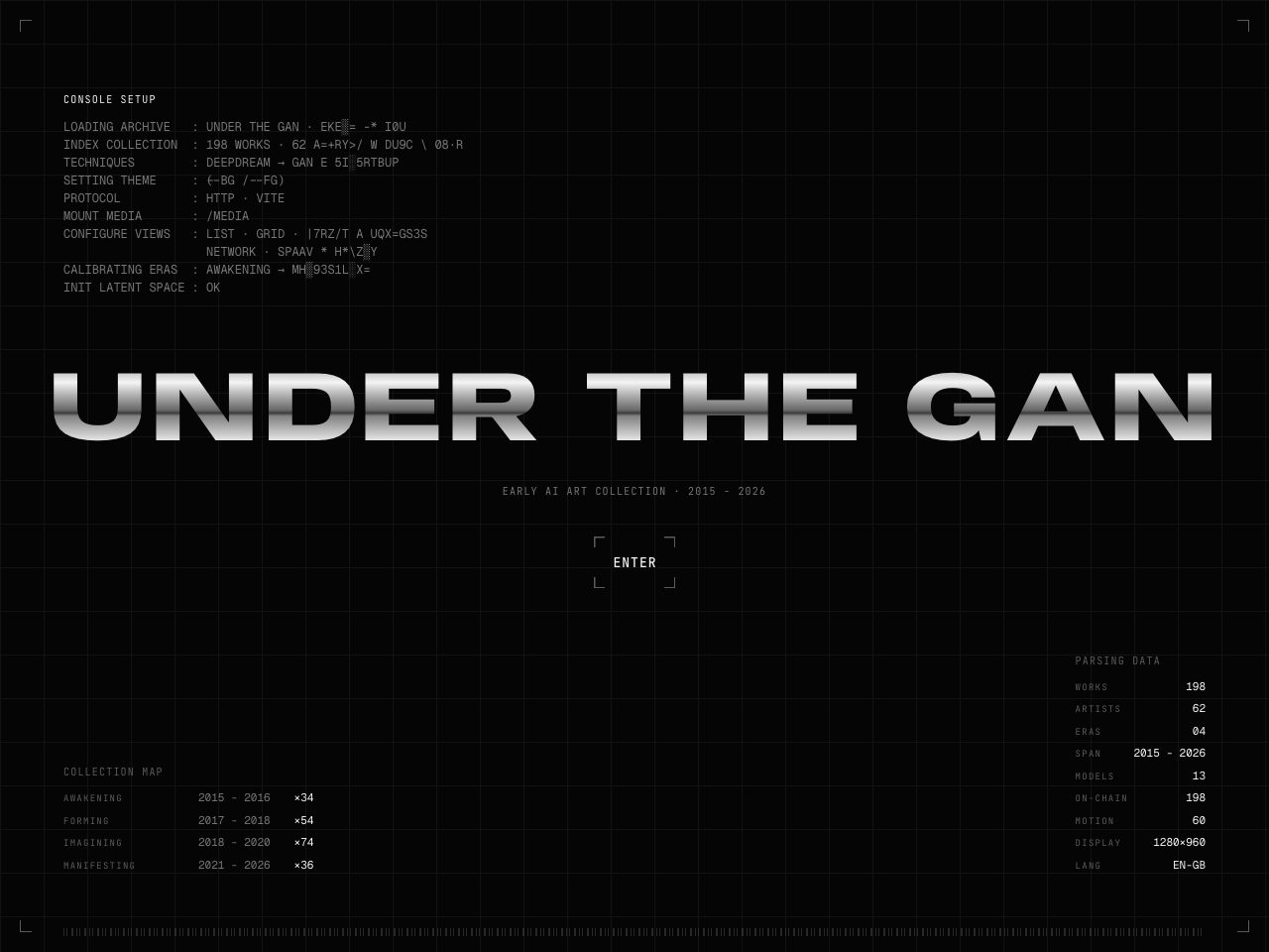
UNDER THE GAN
Creative
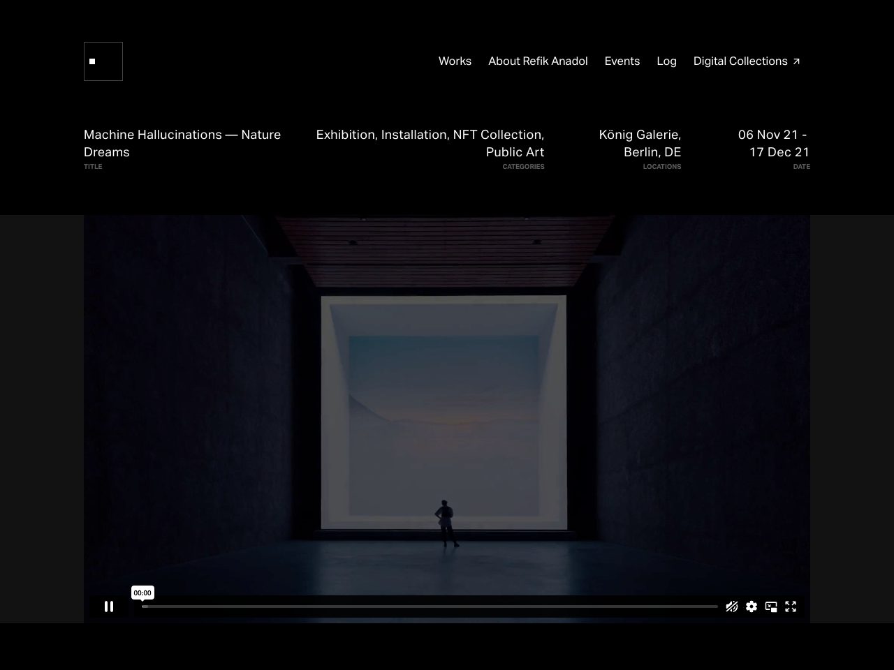
Refik Anadol
Creative
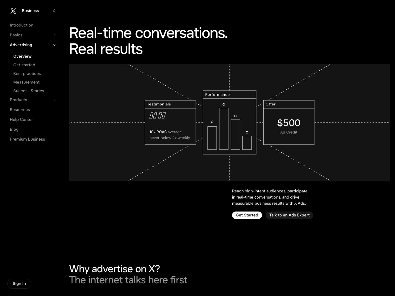
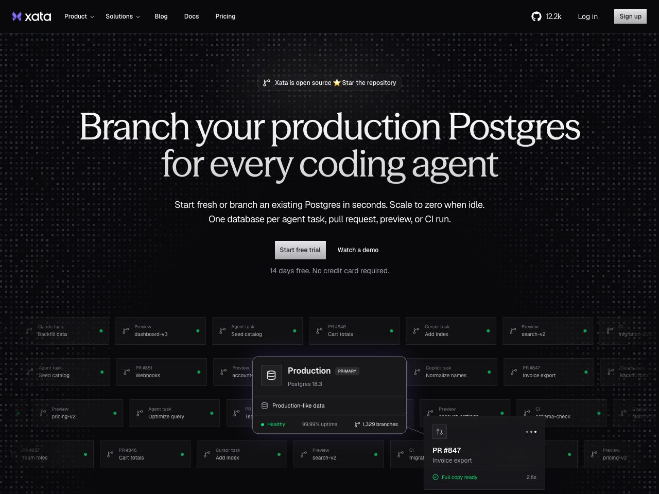
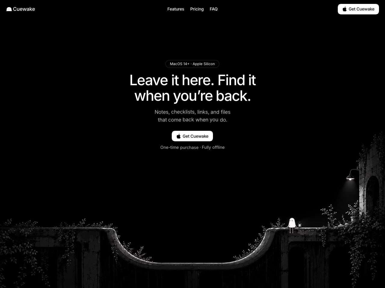
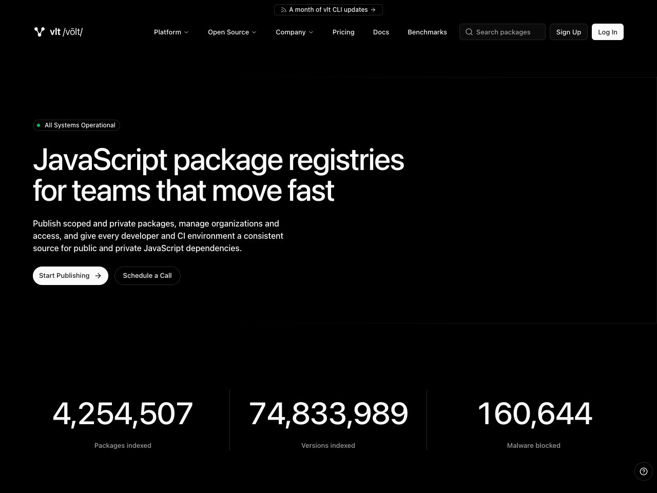
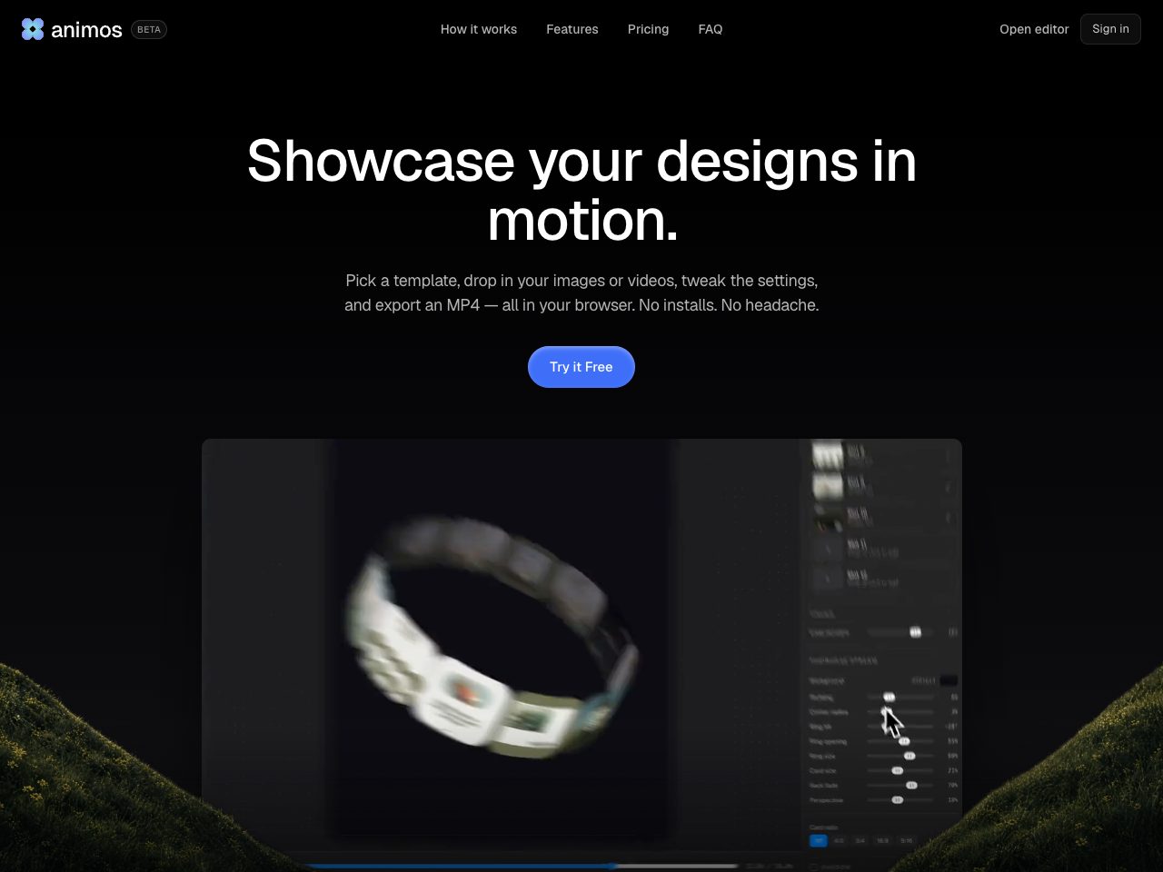
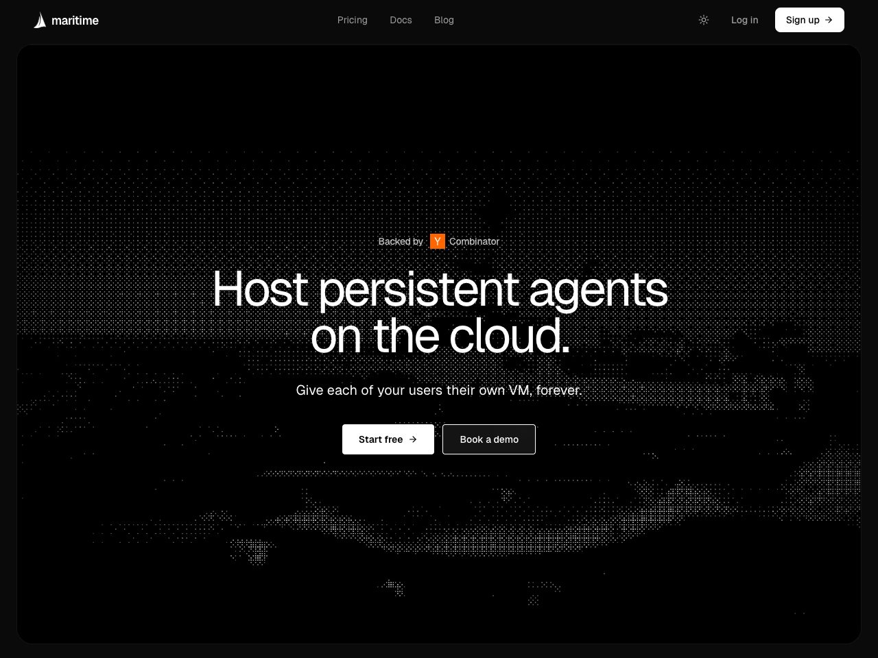
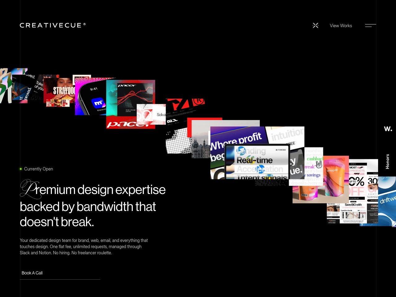
Creativecue
Agency
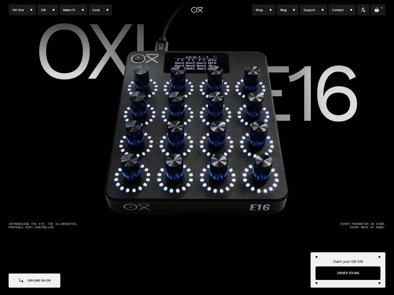
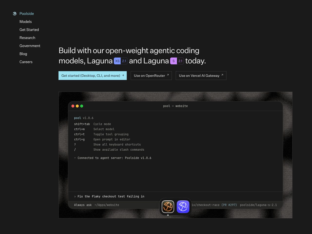
Poolside
Startup
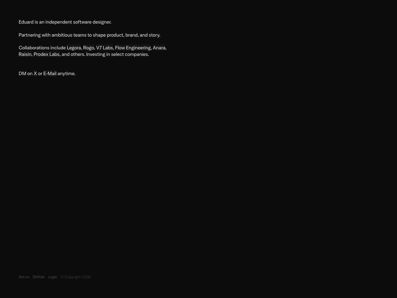
Eduard Wieandt
Portfolio
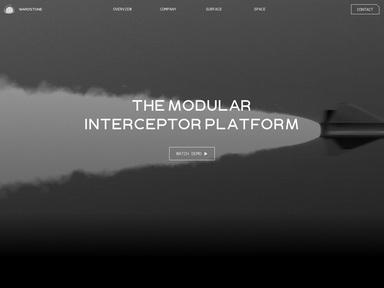
Wardstone
Startup
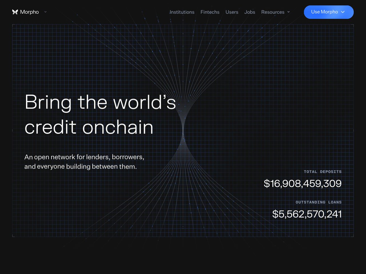
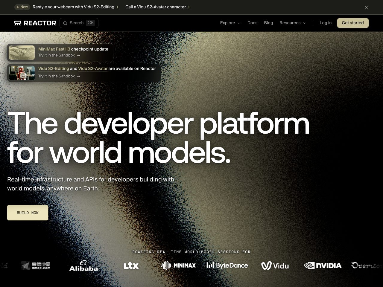
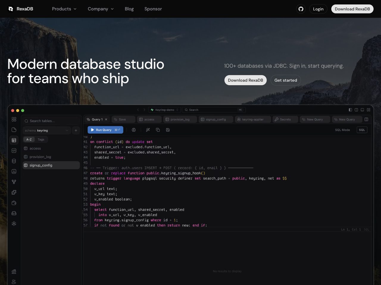
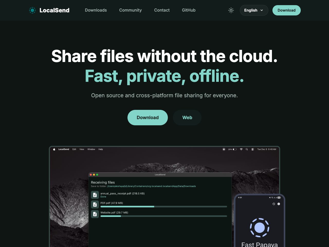
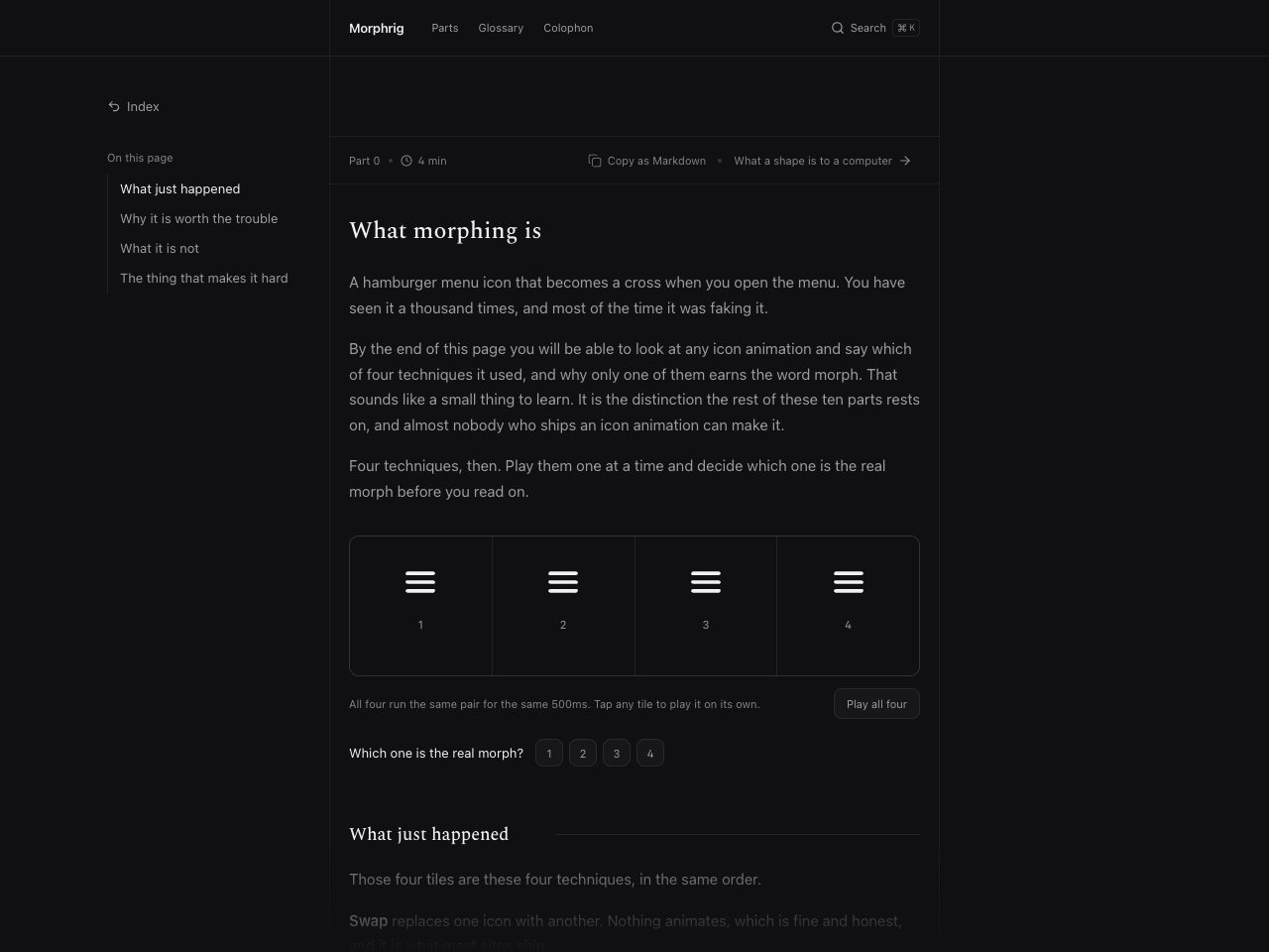
Morphrig
Creative
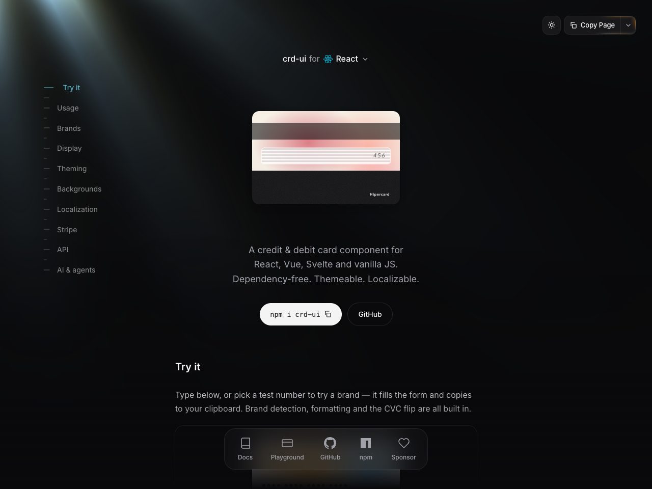
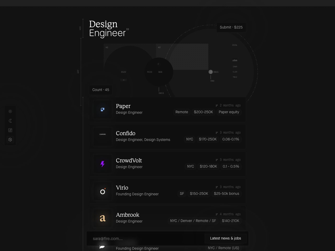
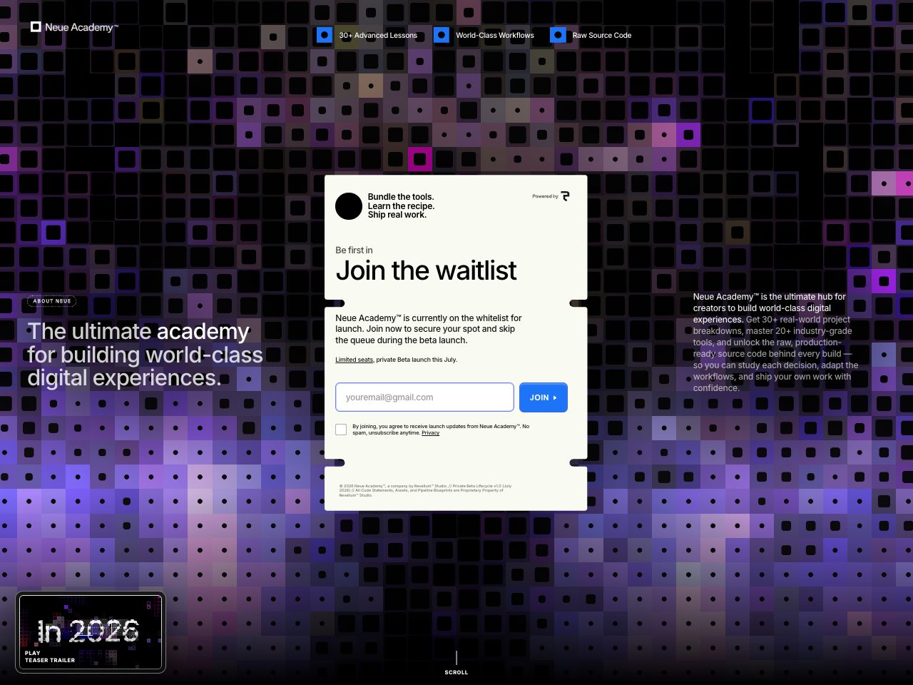
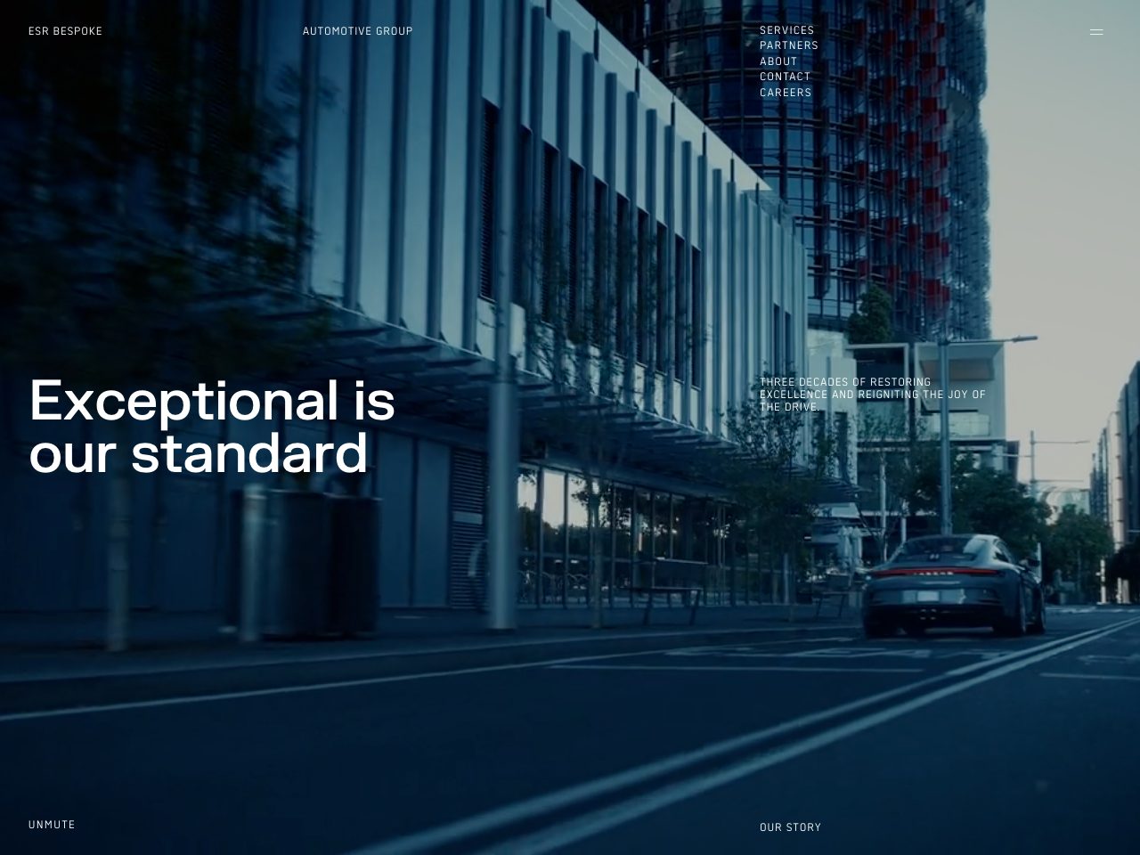
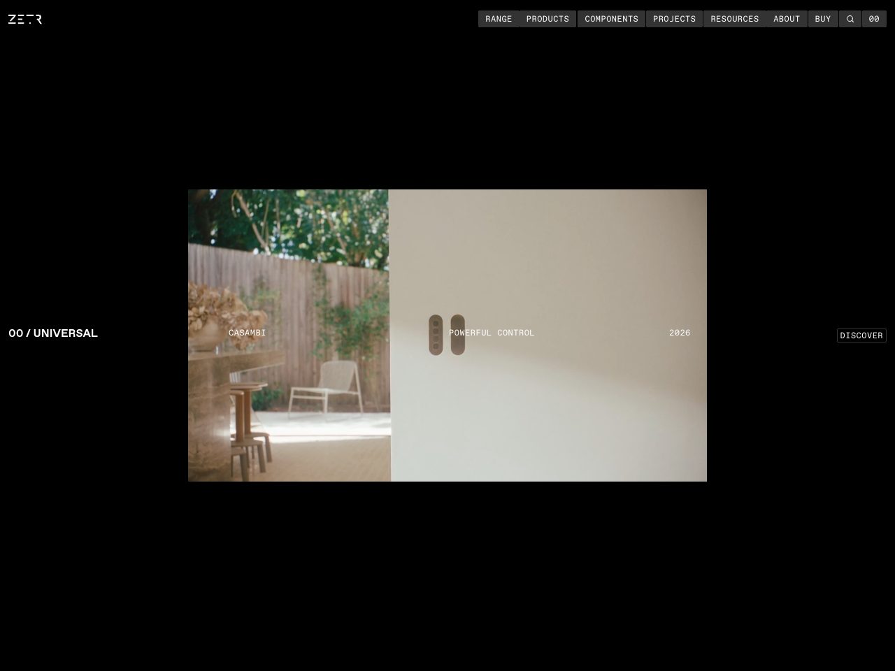
ZETR
Startup
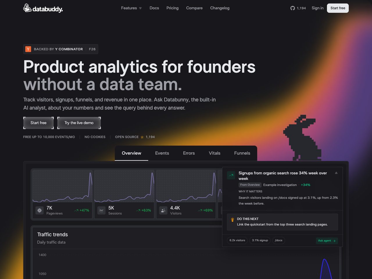
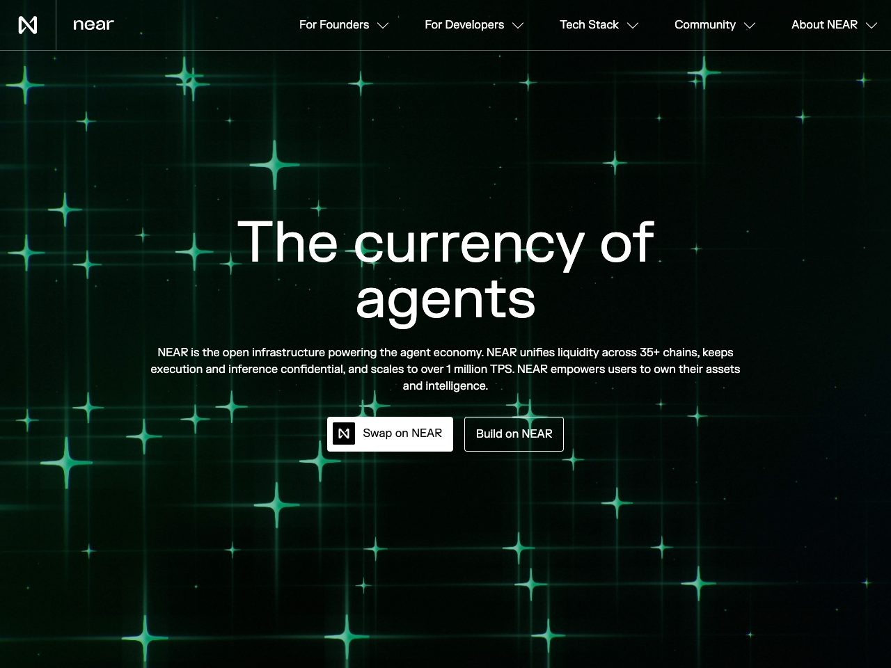
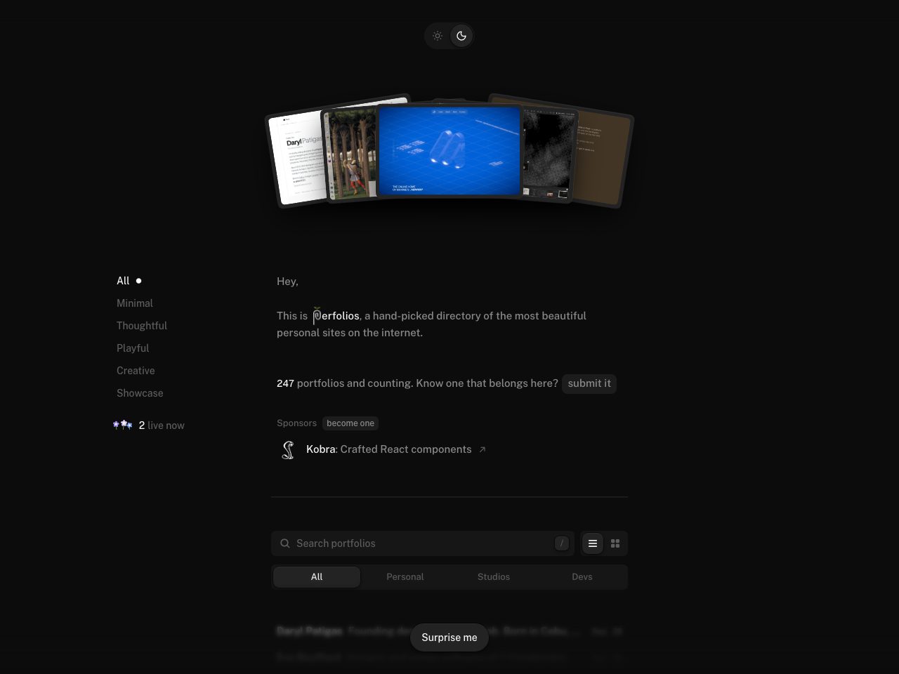
perfolios
Startup
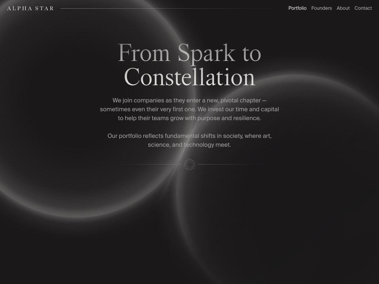
Alpha Star
Startup
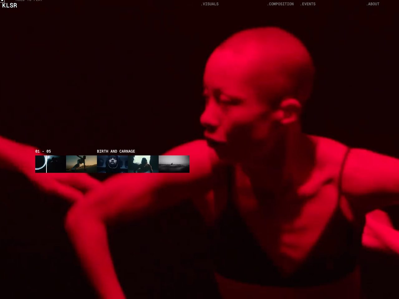
KLSR
Creative
Dark websites by the numbers
Measured across the 125 sites above: mood and dominant colour from each screenshot, typefaces from the fonts each page actually loads.
- Mood
- 100% dark
- Dominant colours
- black 77grey 23blue 10orange 5
- Typefaces in use
- Inter (13), Geist (9), PP Neue Montreal (3), Archivo (2), Favorit (2), Fragment Mono (2)
Inter is the most common typeface here, on 13 of the 93 sites whose fonts could be read, followed by Geist.